United Airlines
Role: User Interface & Experience Designer
United Airlines is a major American airline headquartered in Willis Tower in Chicago, Illinois. It is currently the third largest airline in the world, with more than 100,000 employees and 700 aircrafts, which includes the holding company United Airlines Holdings. It was founded by the American aviation pioneer William Boeing, and emerged from a consolidation of equipment manufacturers and carriers. United Airlines operates a large domestic and international route network spanning cities large and small across the United States and all six continents. The airline currently has eight hubs, including Chicago O'Hare International Airport.
When does your plane journey begin? When you check in? Once you’ve passed security? After you’ve settled into your seat and the aircraft doors have closed? For today’s modern traveler, expectations are now set by their non-travel experiences. They want flexible solutions with an intuitive user interface. The result is an air-travel experience that is completely transformed by digital technologies, starting way before we even consider leaving for the airport, and extending to long after we’ve arrived. The airline industry was one of the first to digitize its business, but this early start has left some with considerable challenges today.
United.com
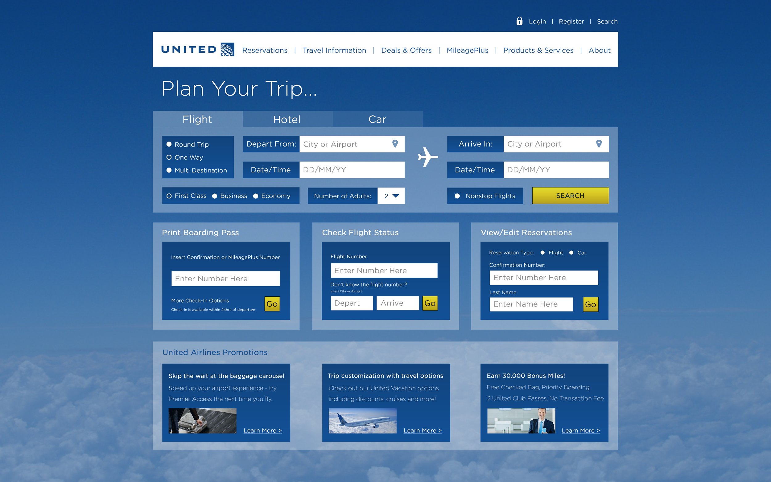
With an increasing number of airlines in the skies, customers have more options now than ever for how to reach their destination. Arguably, the most important interaction for airlines to focus on is the experience for the booking of a flight. In theory, this task seems simple enough. Choose your destination, select your departure and return dates, fill out passenger information, and then enter your credit card details. When working with limited real estate, designers and developers need to be more conscious of supporting the user’s goal and not overwhelming them with confusing navigation and walls of text. Airlines also have to balance the additional pressure of filling their home pages with promotions that can distract users from the most pertinent information.
When users first arrive at the United Airlines website, the goal was to provide them with a clear path forward. We were mindful of these goals and made sure to keep everything simple and intuitive. Users were provided with a concise set of instructions on how to proceed with the task at hand such as searching for a specific airport by name or its location. We wanted all users to transact without a high barrier of entry. Not requiring them to create an new account to book a flight was an important part of this design.
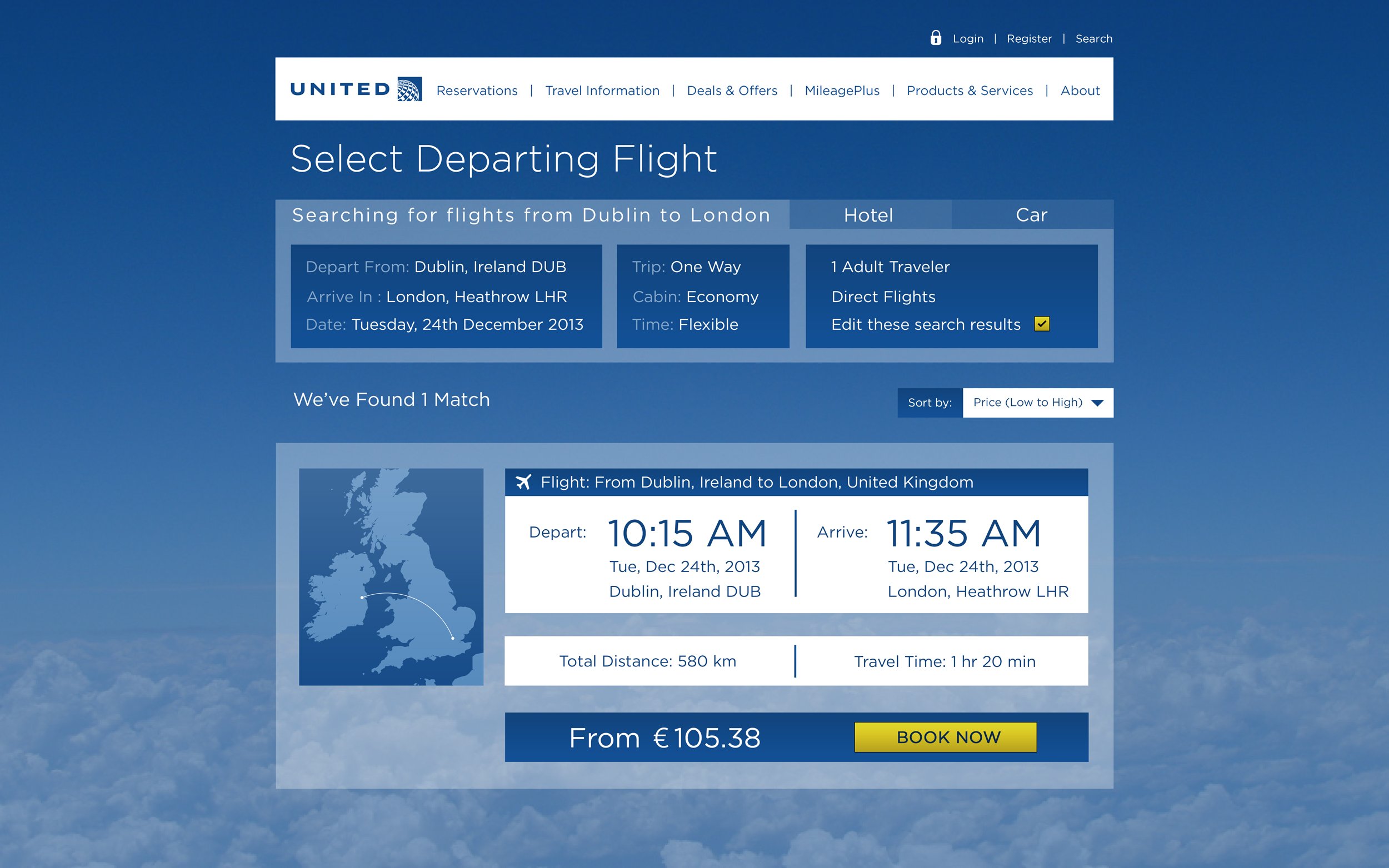
An emphasis was placed on clearly identifying which departure and return flights the user was taking actions on. Requiring as few interactions as possible allowed users to accomplish tasks by presenting them with an immediate set of options to move forward with each time. Calendar actions were altered in order to appear on the same menu panel, so users didn’t have to memorize flight information. Flight selection was streamlined so that it was clear to users what they were doing and the impact of those actions. Engaging visualizations were also incorporated to encourage the user to continue their journey through to successful payment.
© 2025 United Airlines


