BrightWork
Role: Product Designer
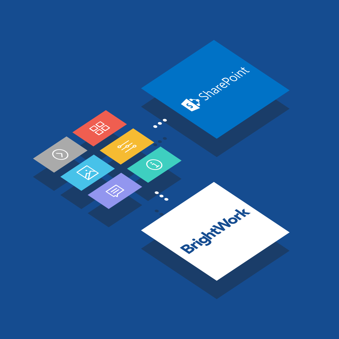
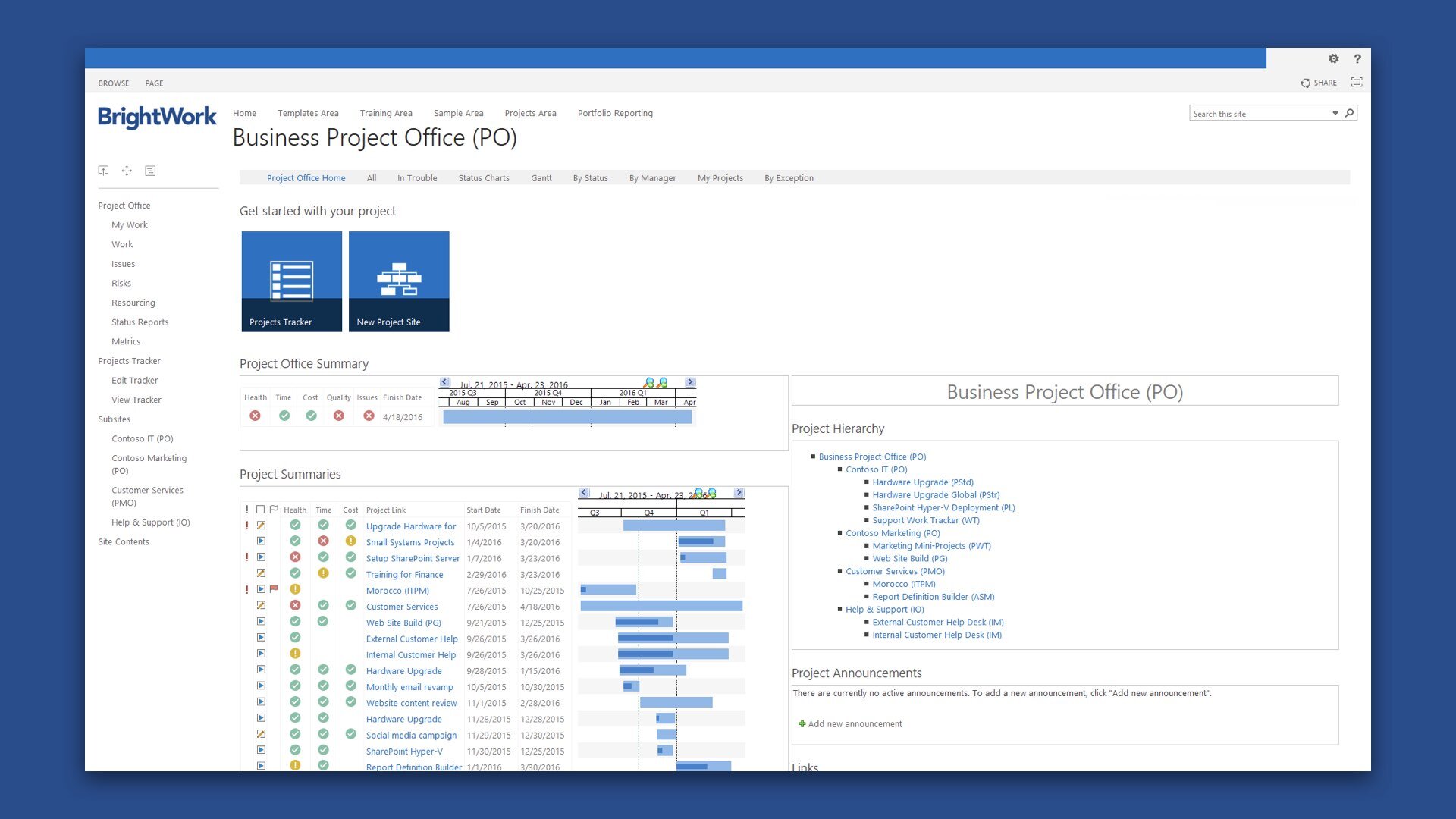
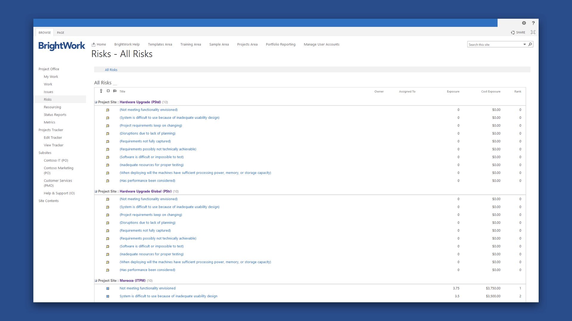
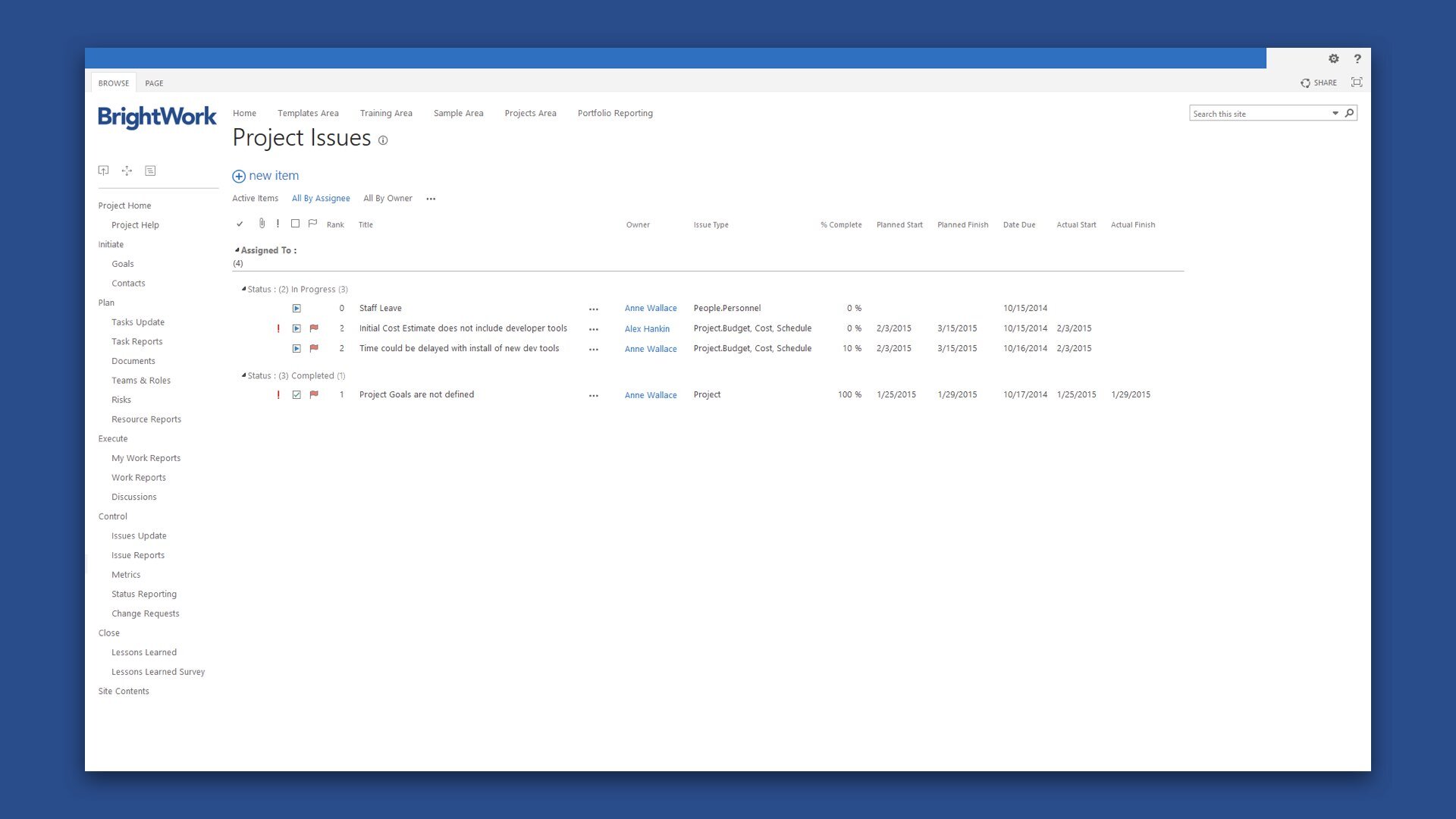
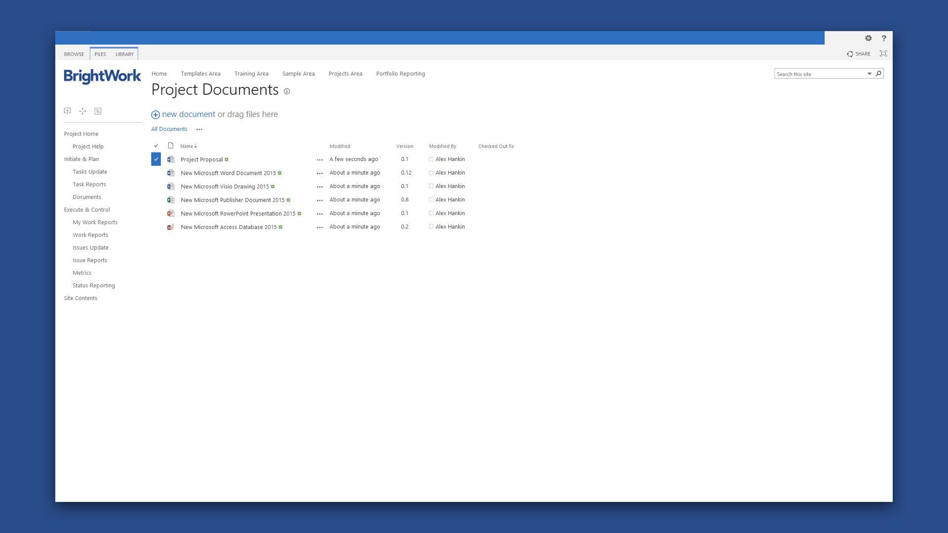
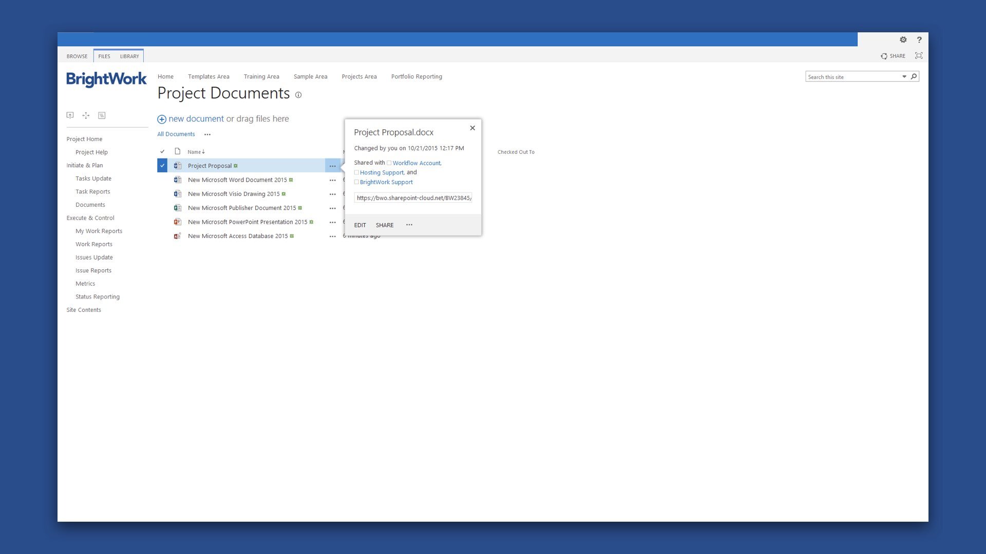
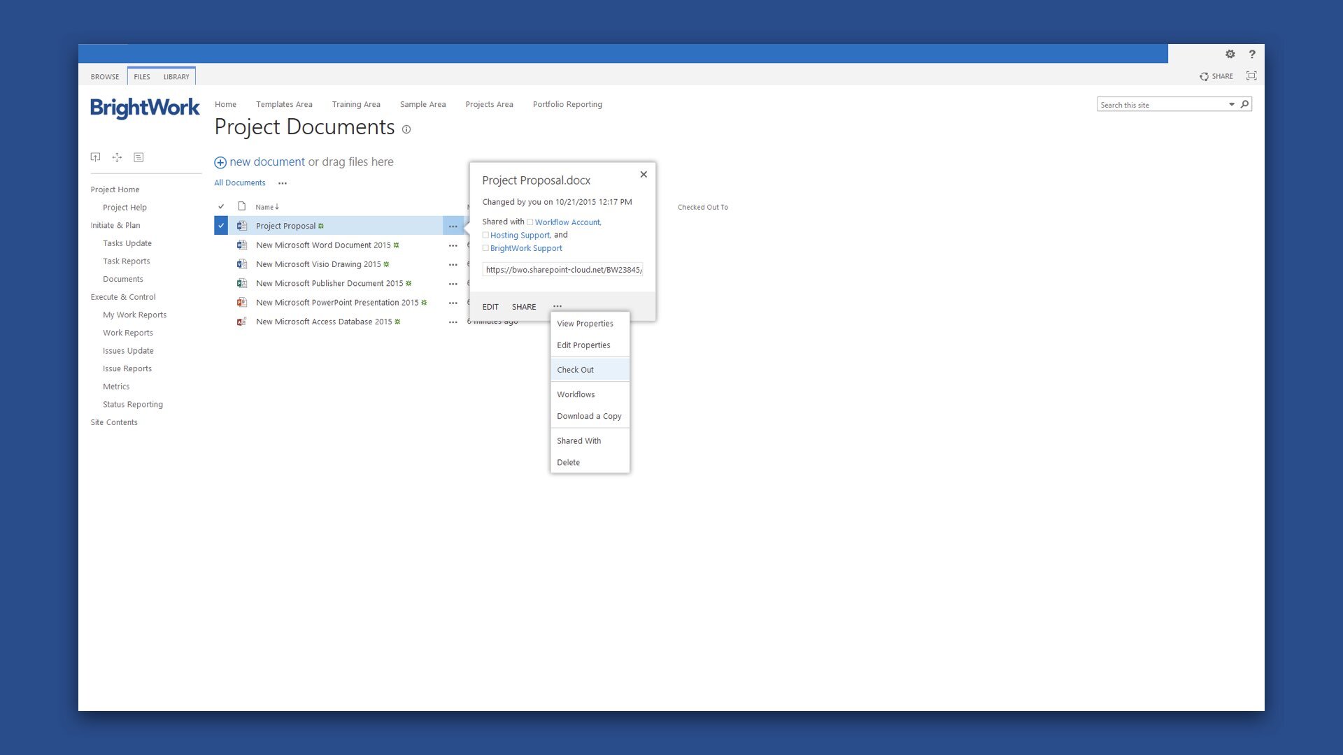
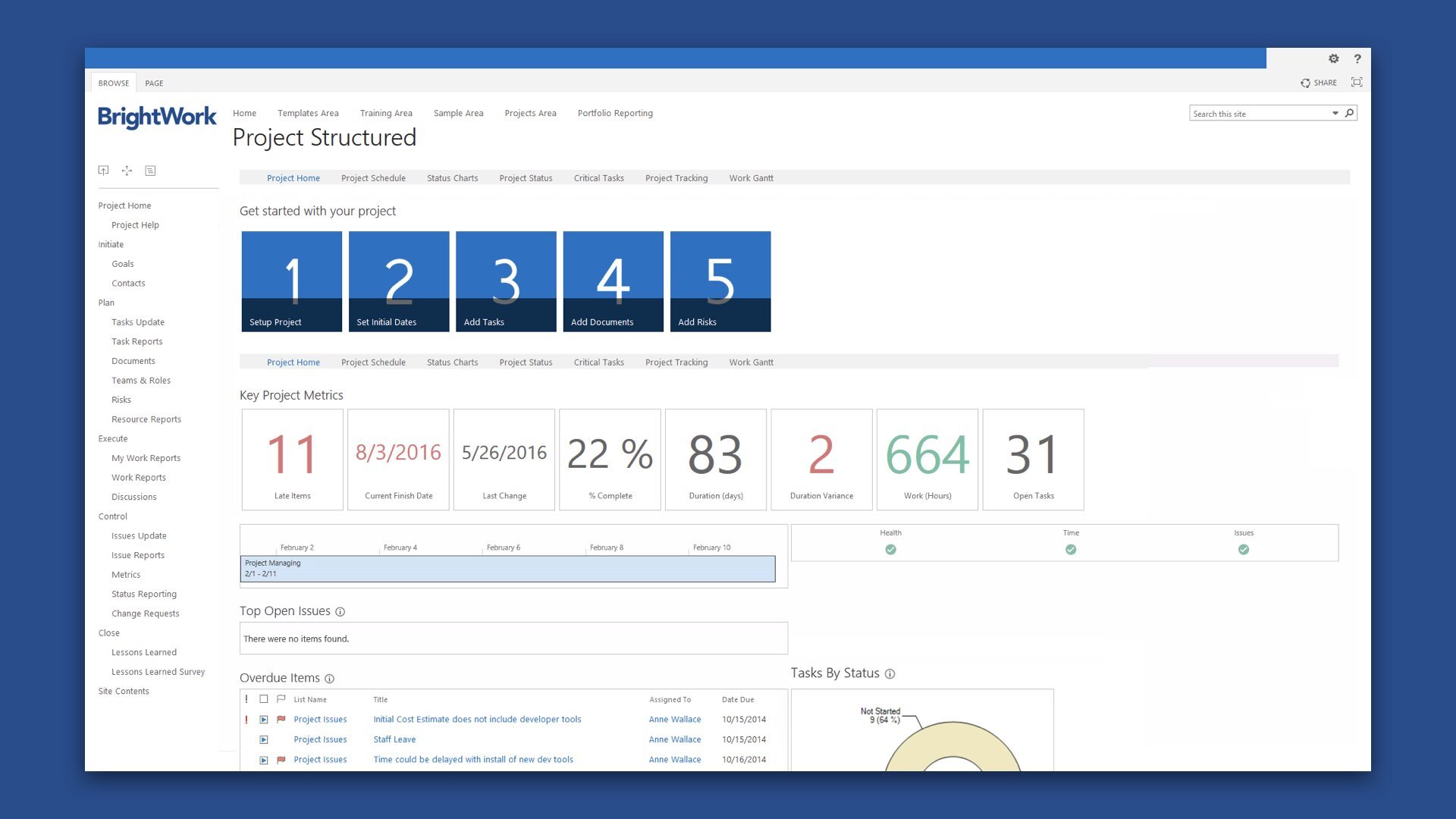
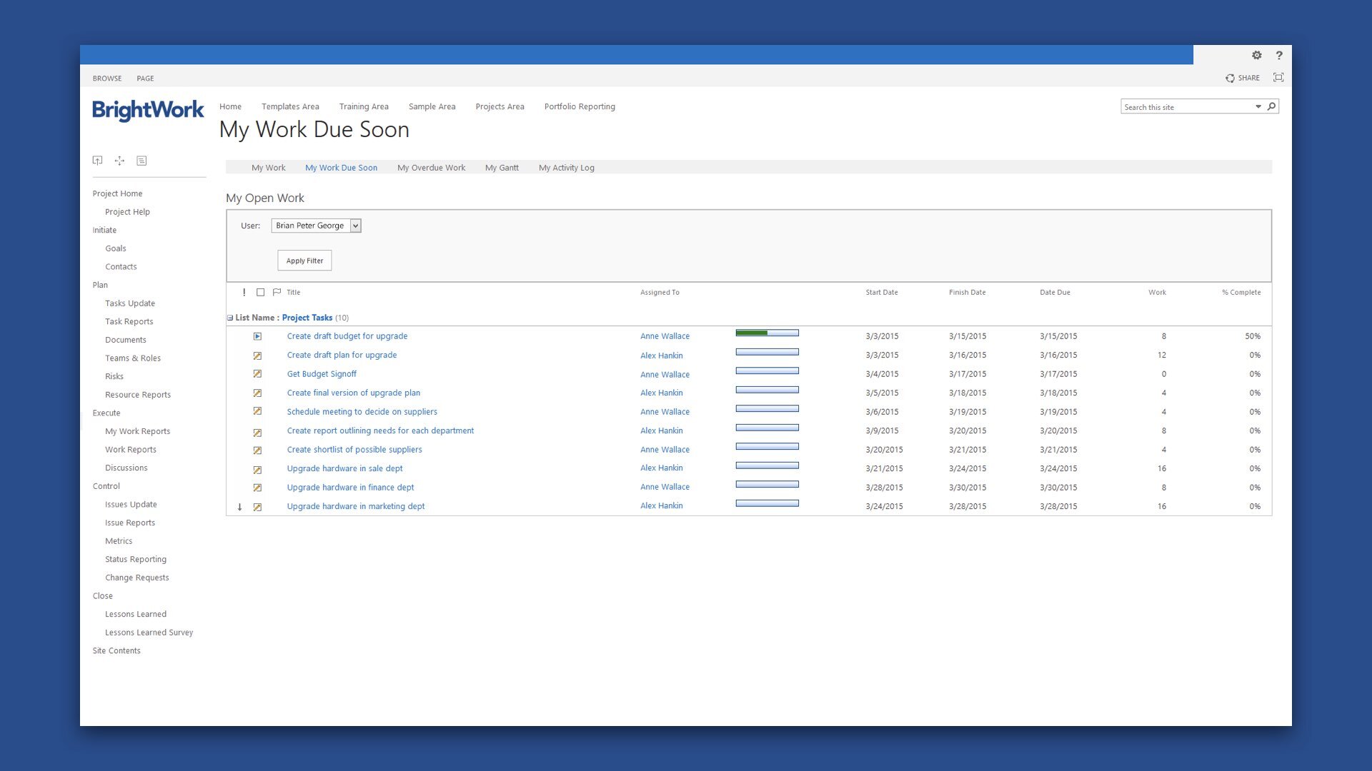
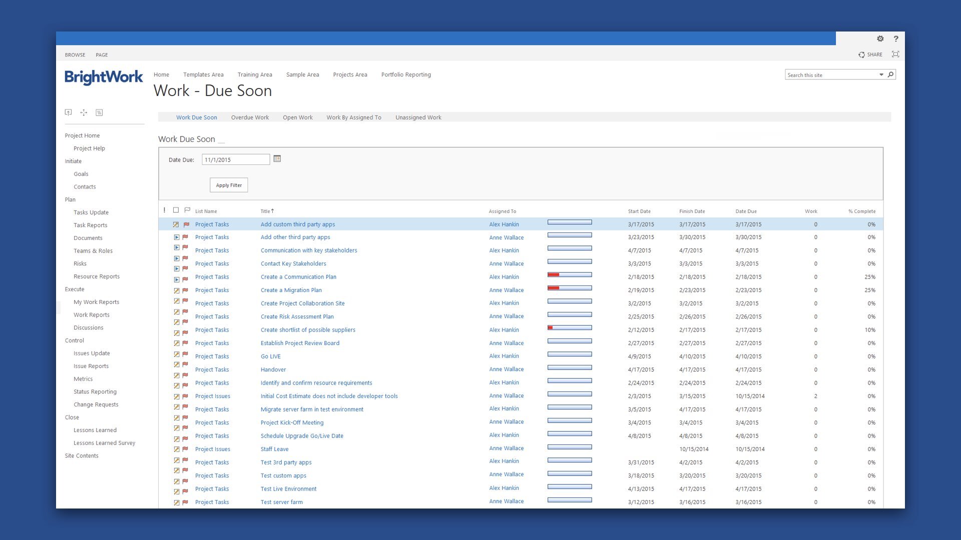
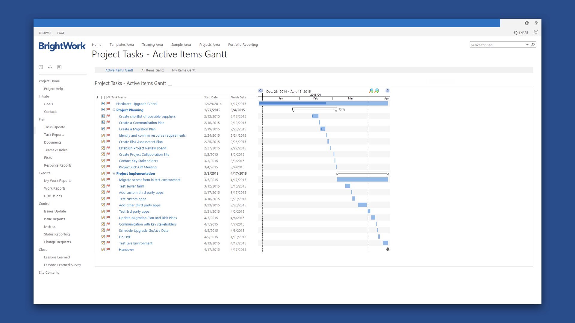
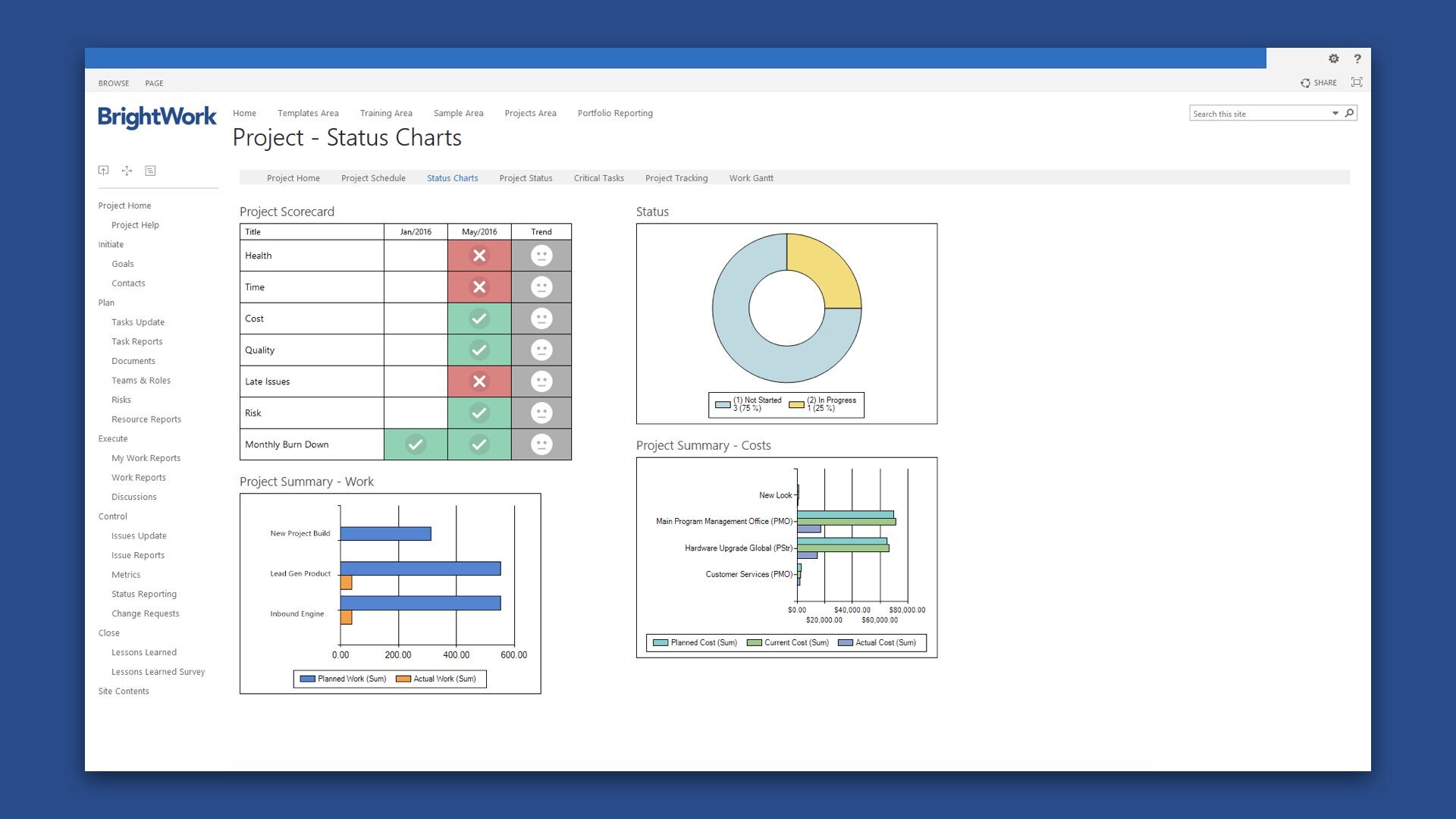
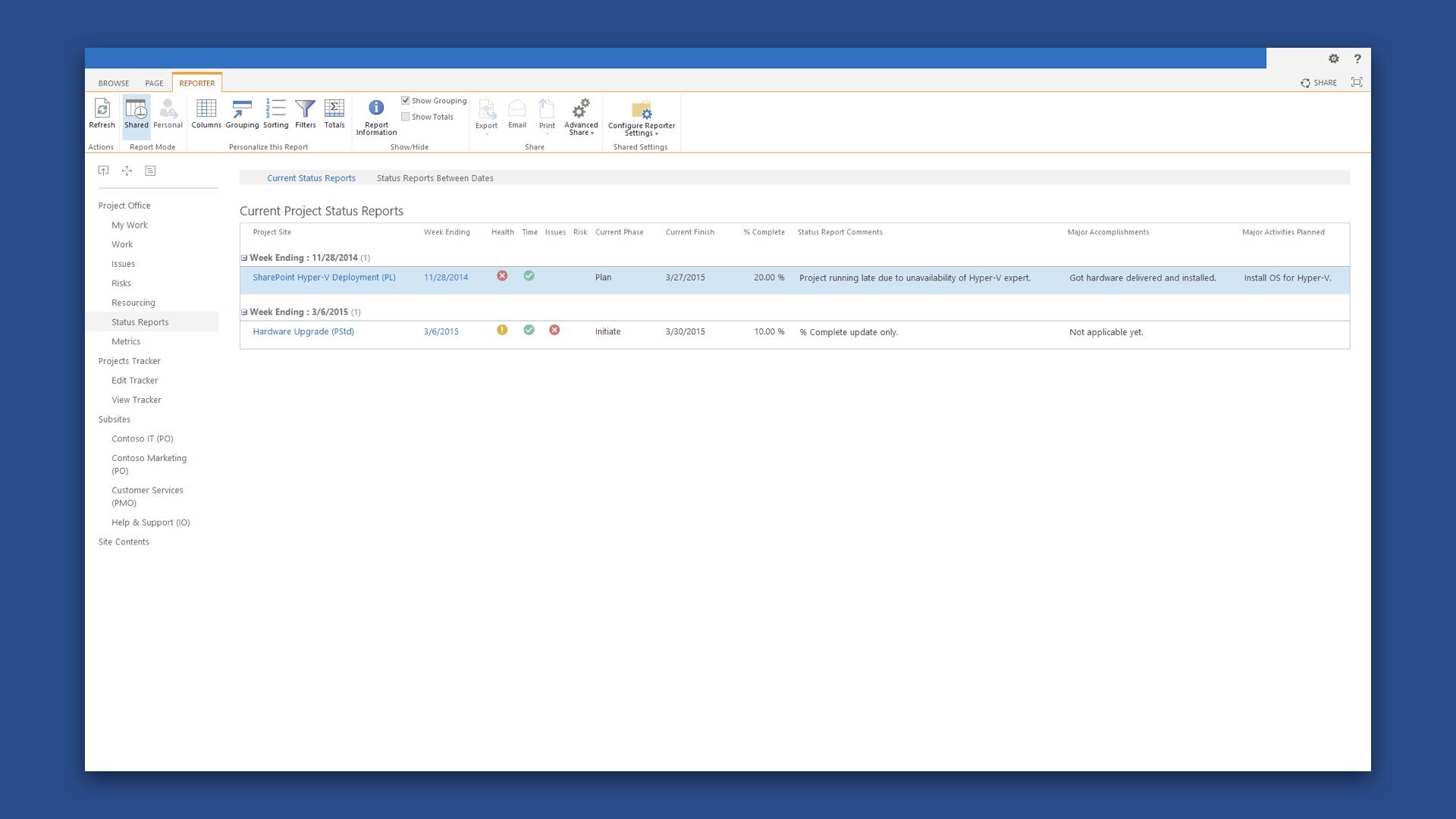
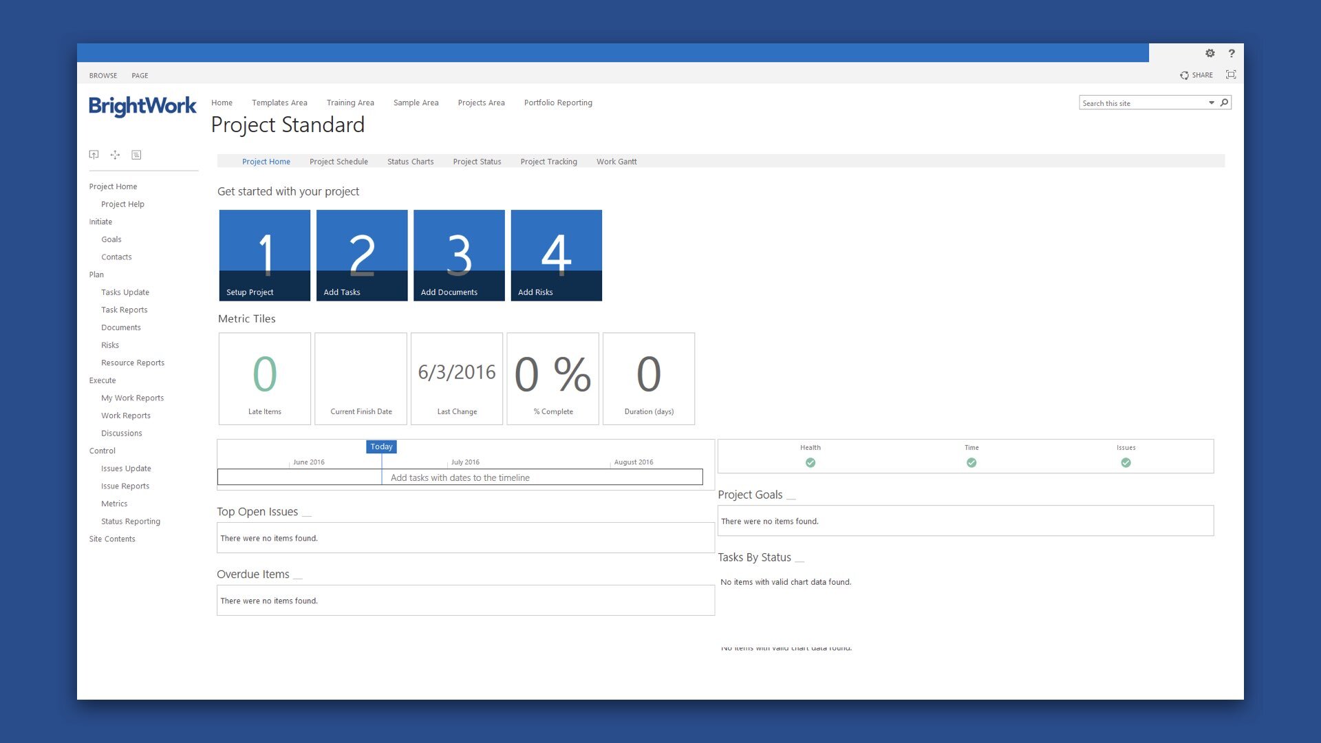
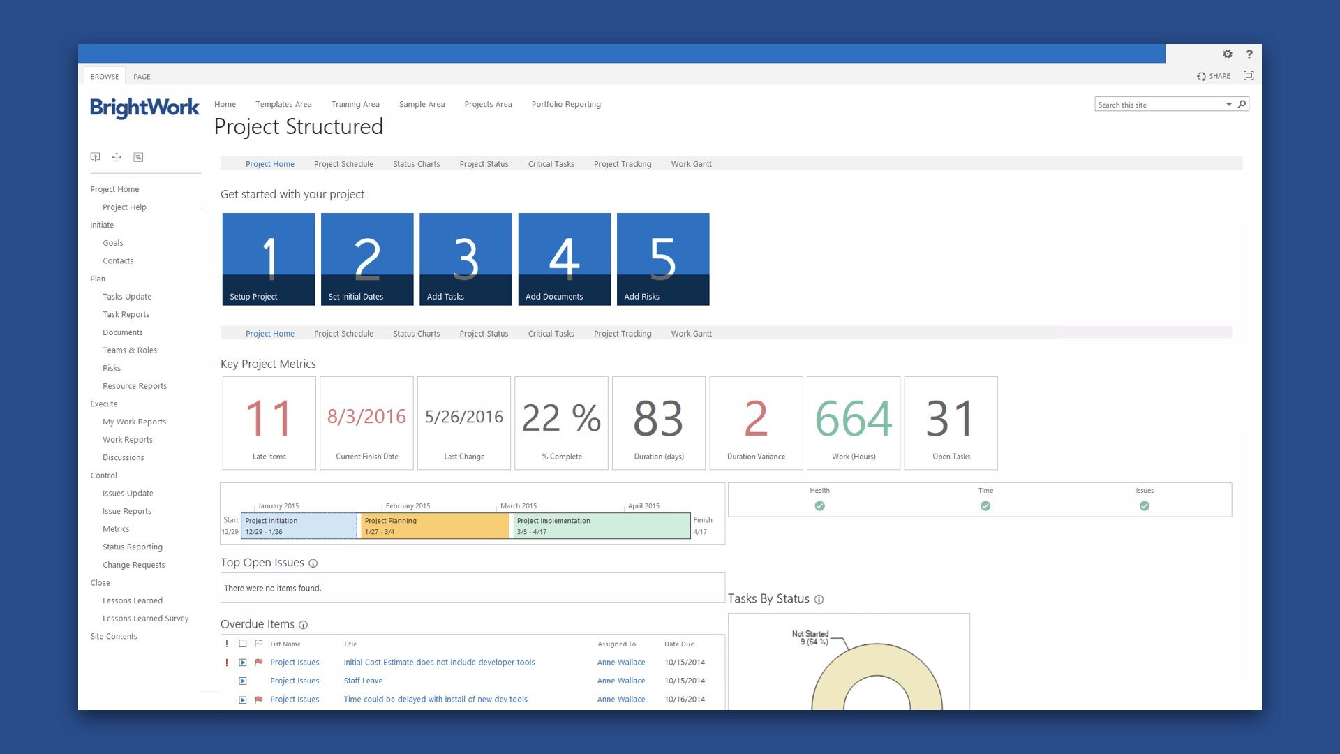
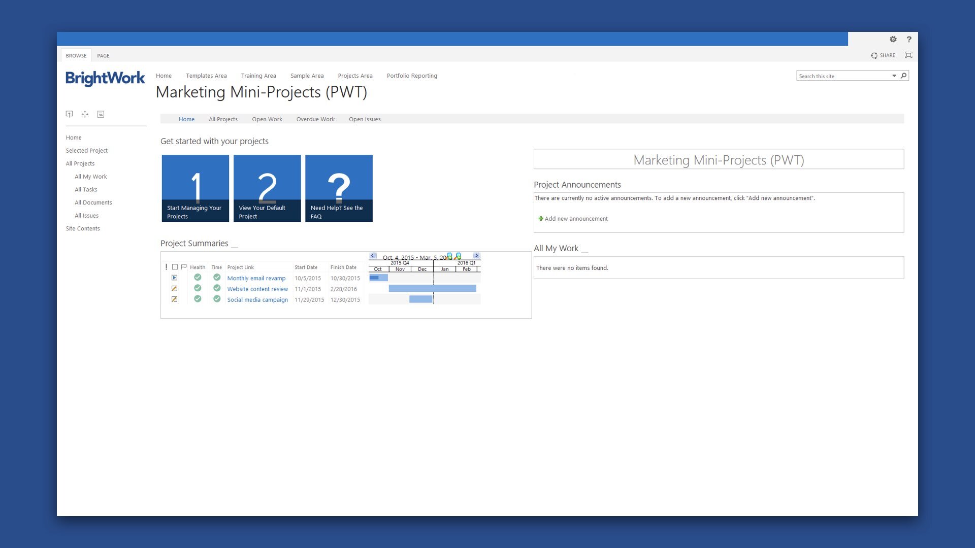
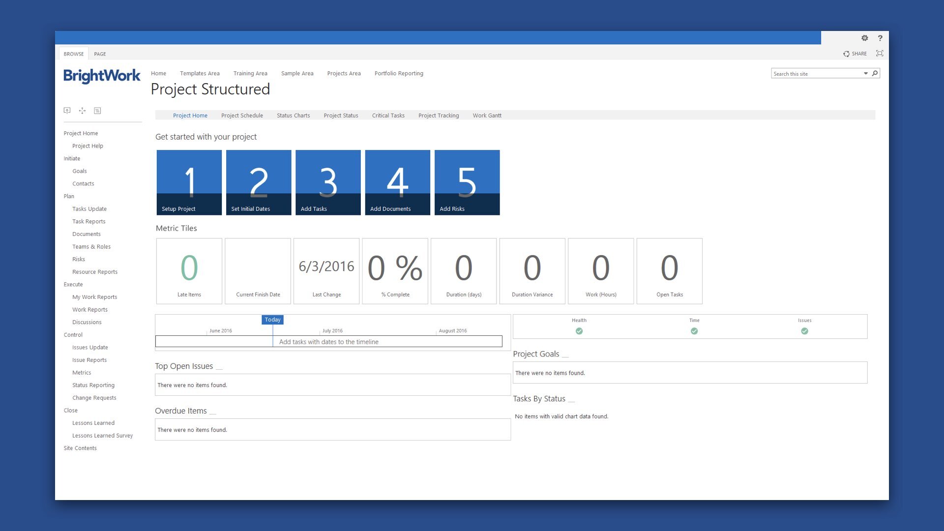
BrightWork is a Microsoft SharePoint software solution for project and portfolio management that includes a range of best practice templates and configurable reporting. The collaborative templates and automated reporting enable project managers to increase the likelihood of project success, and gives senior executives the high-level visibility that they need to ensure customer satisfaction. BrightWork is designed to let users get started wherever they are by focusing on their immediate needs, and then helps them to gradually evolve project management processes to where they need it to be. With highly configurable templates, robust customer support, extensive training materials, and a practical deployment approach, it gives users all the tools they need to mature their project management processes. BrightWork can be deployed on-premise or hosted in the cloud. It can also be connected to Microsoft Office 365, allowing users to seamlessly access and manage all their projects.
At BrightWork, we know that customers rely on project and portfolio management in order to innovate and grow. We also know many projects fail as teams lack the tools and guidelines to collaborate successfully. We created the application in order to help organizations achieve successful collaborative project and portfolio management on Microsoft SharePoint. BrightWork is a long-time Microsoft Partner with offices in both Galway City, Ireland, and Boston, United States of America. Utilizing the company philosophy of ‘Start - Evolve’, we help our customers to gain immediate visibility into the status of projects and gradually evolve project management maturity in their own time. There aren’t many companies in the project management world that can claim to have been in existence for more than 25 years, but BrightWork can. In the rapidly changing and iterating world of software, to successfully remain in the field for so long is rare.
Design System
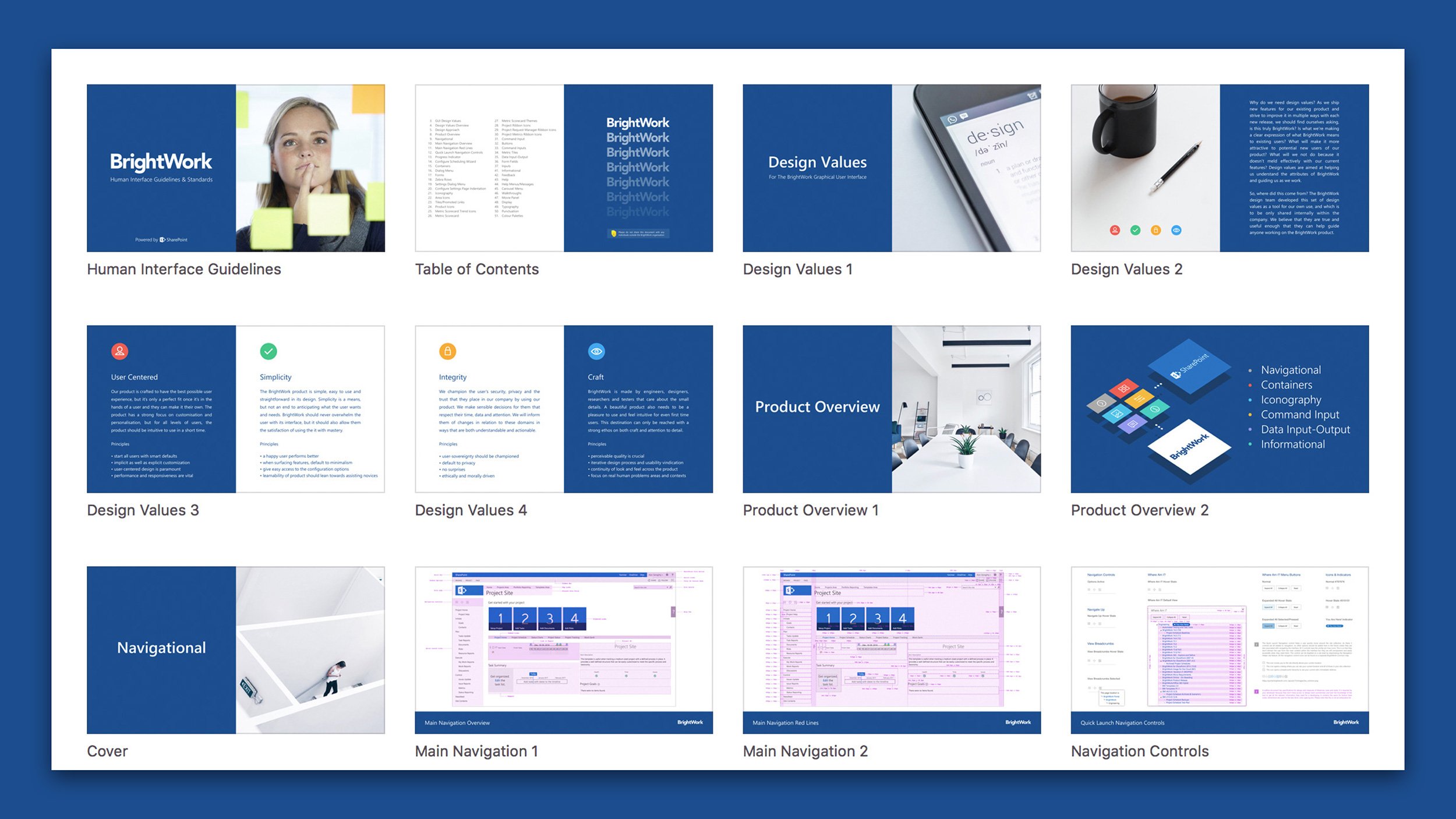
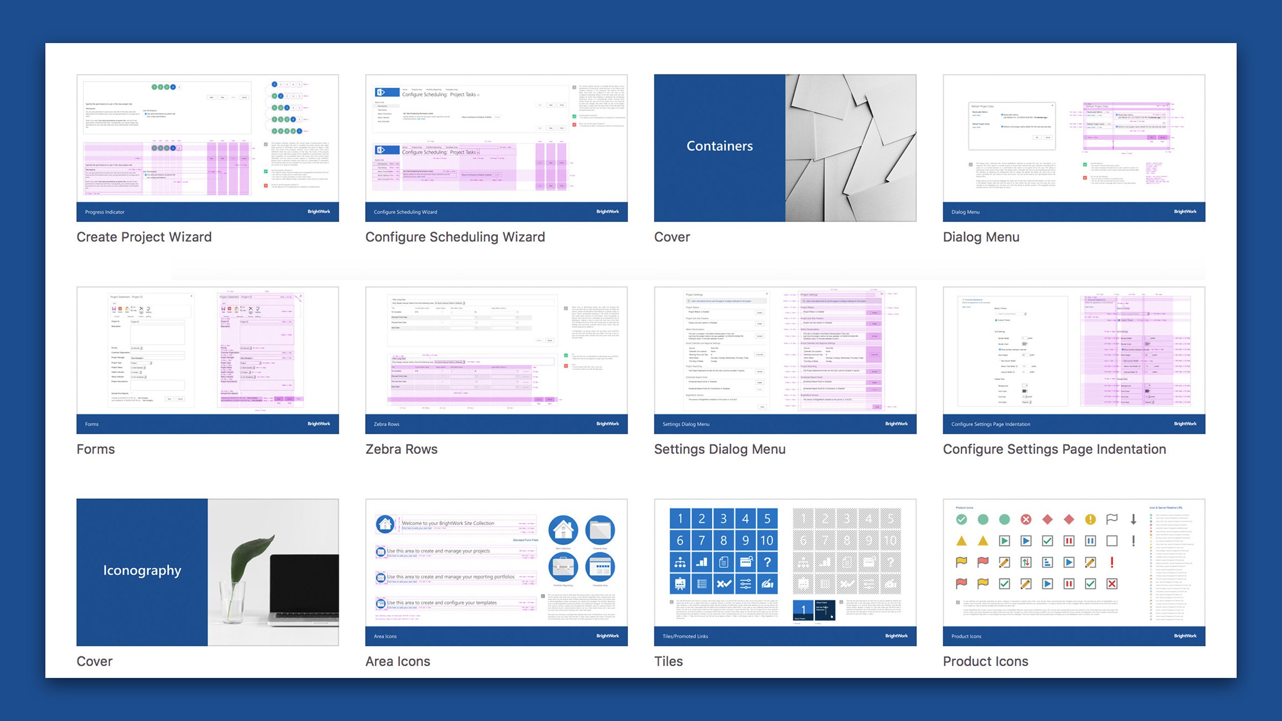
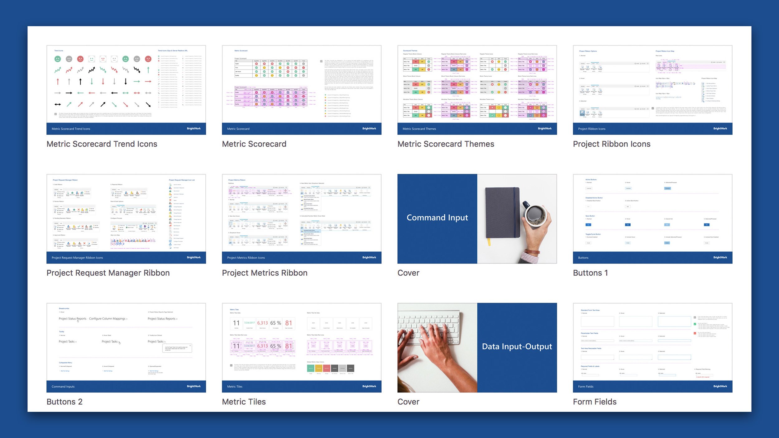
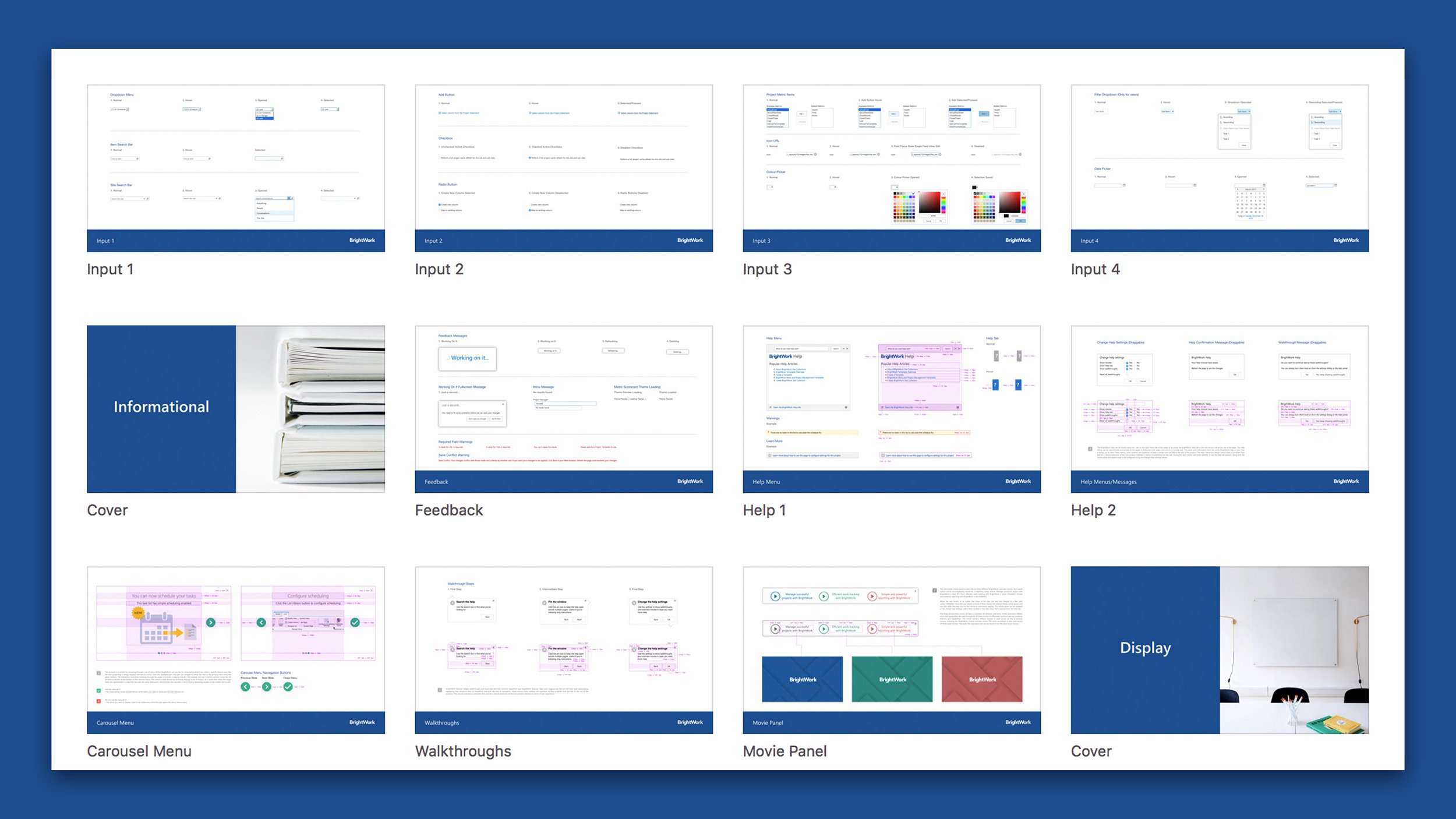
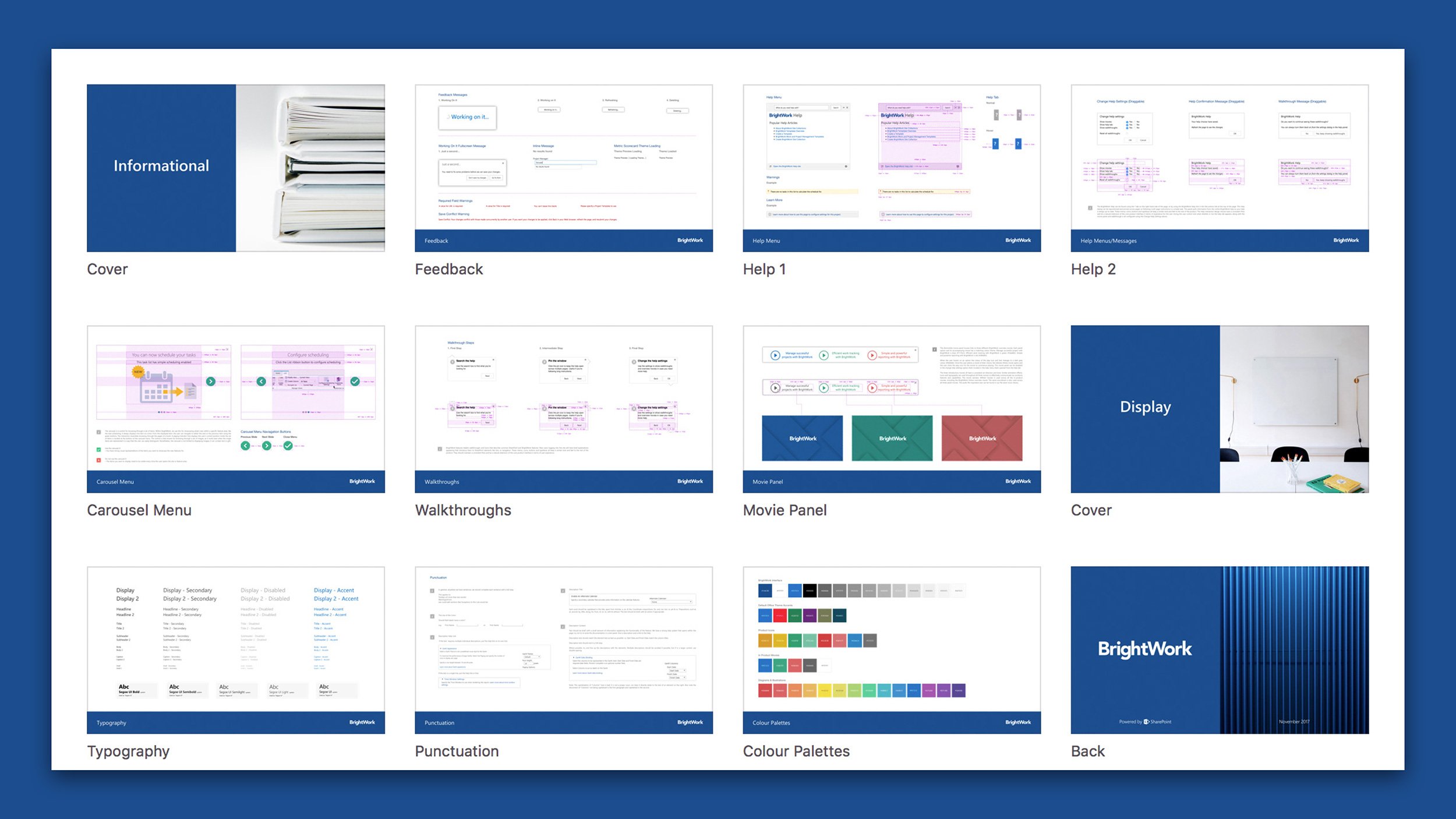
I led the creation of the BrightWork Design System to improve our product design process, manifest our design principles, and provide our customers with a usable, accessible, beautiful project management solution. So, where did this come from? The BrightWork product team developed this set of design values as a tool for our own use, and was initially only to be shared internally within the company. I worked closely with a handful of talented engineers to overhaul the BrightWork product and write the guidelines for how and when to use different patterns and components. The system had to work within the existing product suite, but also needed to be a platform for evolution. By sharing similar components and patterns, we wanted the development team to integrate tests into their product with variants, then report back to the platform to improve or otherwise tweak the relevant pattern, which would benefit the overall user experience.
We believed that the guidelines were detailed and useful enough that they could help guide anyone designing and developing for the BrightWork product. As this project unfolded, we developed a shared language about how we built product that helped our engineering team to harmonize our way of building and shipping new functionality. Over the course of a year, numerous design improvements were made to the whole product suite as a result of the newly created design system. Ultimately, the project was the combination of visual language, technology, and the needs of the people that use the product to reach their goals.
Help & Guidance
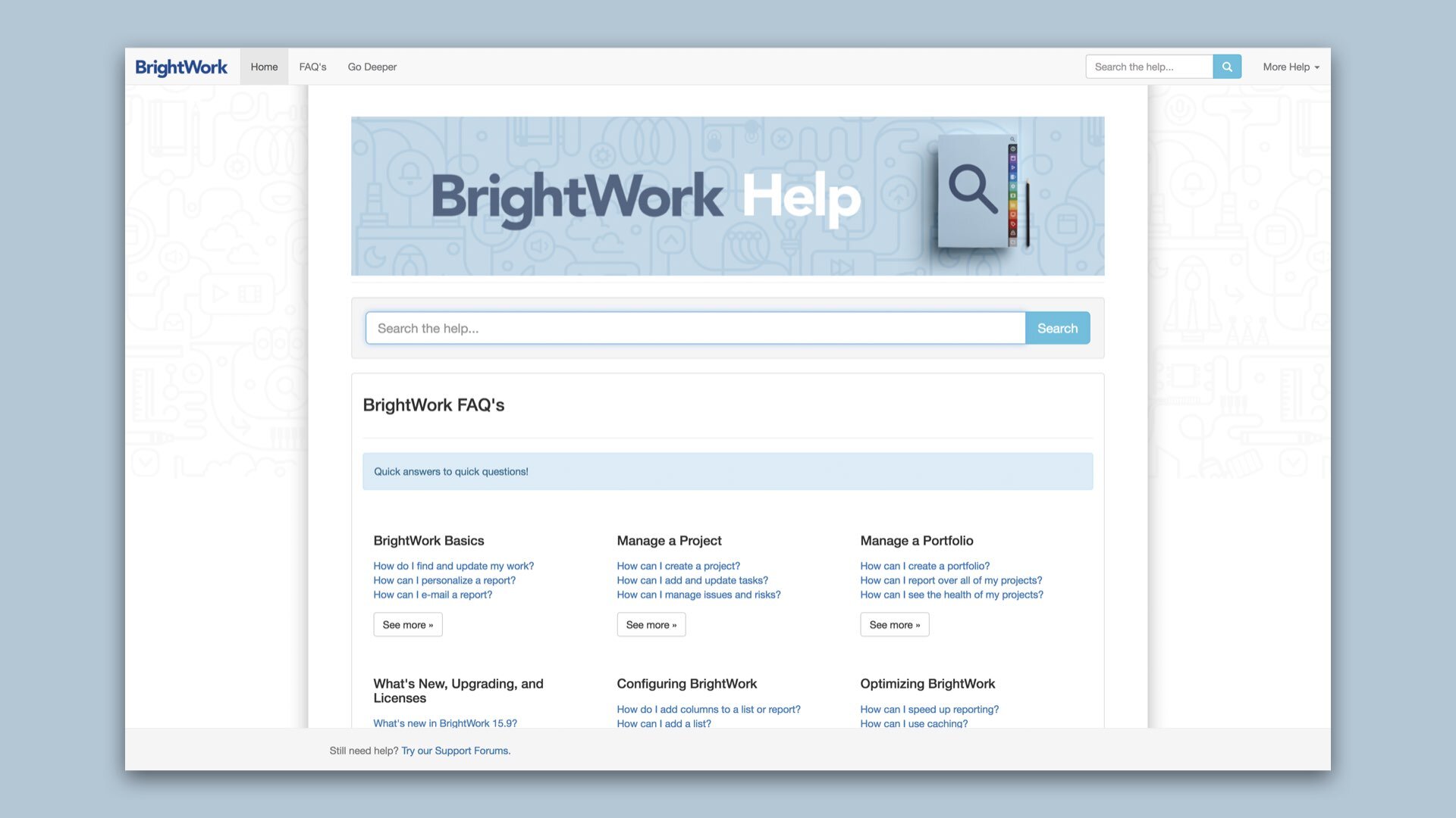
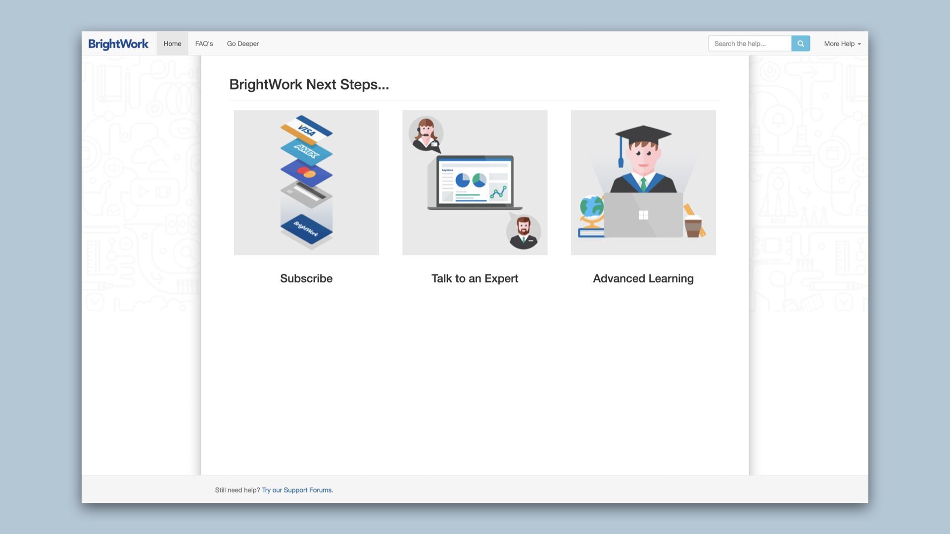
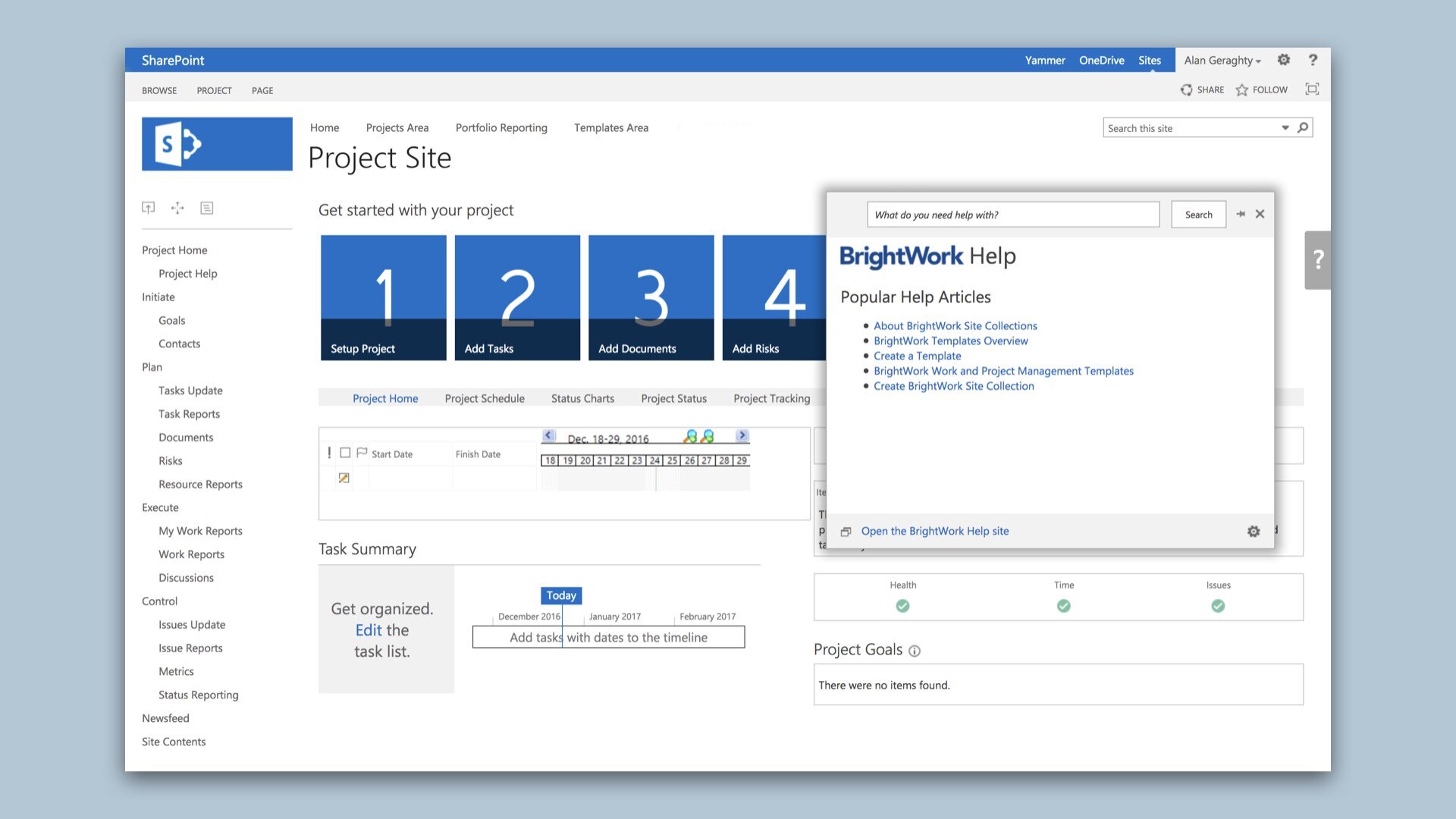
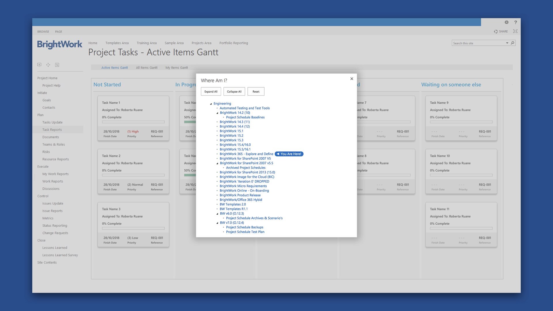
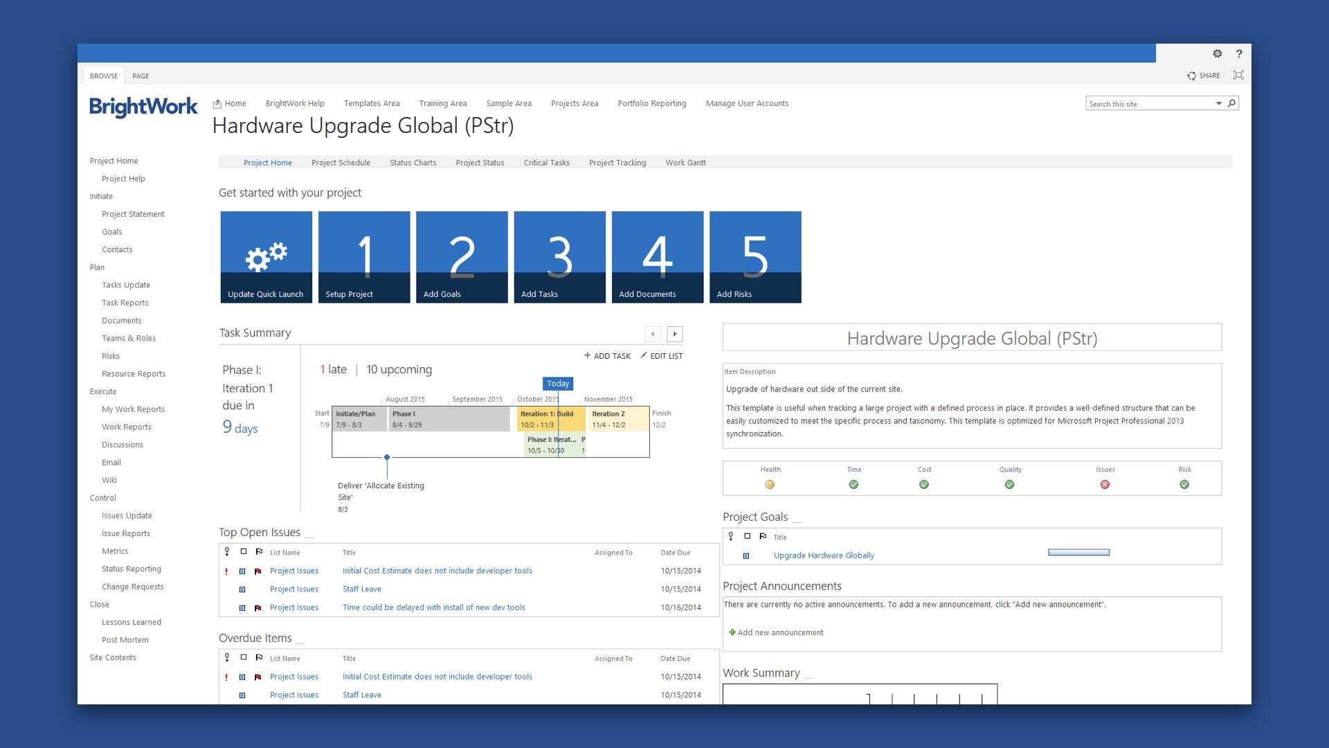
I worked closely with the user assistance and documentation writer to redesign the BrightWork Help resource for the application. Aside from overhauling its existing look and feel, we focused on improving the searchability of the content. The discoverability of this resource was also improved by embedding it directly within the application itself. The in-app help dialog could be re-positioned and pinned across pages so following multi-page instructions such as creating a new cross portfolio report was a breeze. The panel pulled information from the online BrightWork help so the resource was always up-to-date. Frequently Asked Questions were dynamically surfaced throughout the various product areas, determined by the end users usage patterns.
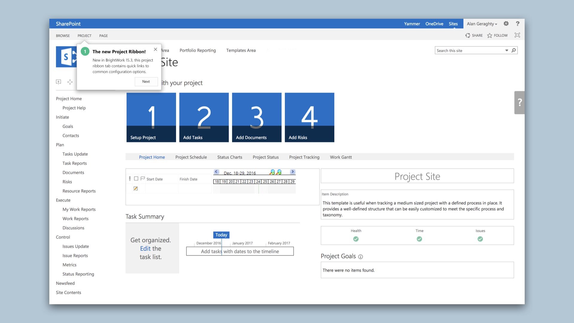
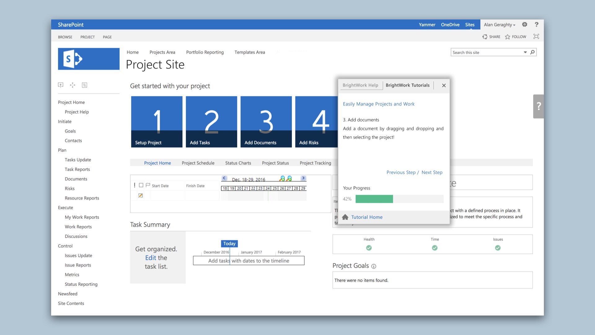
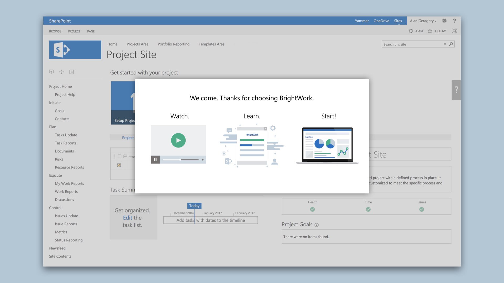
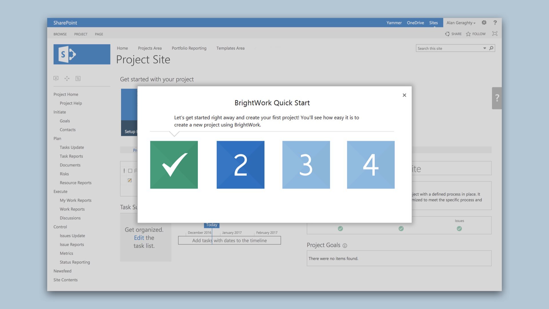
I also worked on the in-app guidance and walkthroughs. New users logging into the application would see brief explanations that introduce them to primary BrightWork interface elements such as navigation, settings and configuration. Tracking each users progress through these walkthroughs and tours helped encourage usage of both new and existing product features. The in-app guidance and walkthroughs ultimately resulted in increased user engagement and improved functionality awareness.
Explainer Movies
It can be daunting when first getting to grips with a new project management application. Not everyone will understand the ins and outs of the concepts immediately and so trying to explain the product to new users and getting them engaged about it at the same time can be a huge challenge. In collaboration with several members of the marketing team, I produced a series of movies that would appear within the application. These movies were designed to get new users up-to-speed with BrightWork and explain its key concepts. At the top of the core areas in the app, a dismissable block with links to embedded movies would appear.
Product Features
I worked with the engineering team on delivering fixed quarterly releases of the on-premise and cloud versions of the product. I was involved in the creation of each feature for every release, through numerous stages. These new features evolved from phases including ideation meetings, story-mapping sessions, wireframing, defining user stories, high fidelity design, interactive code prototypes, usability testing, and manual testing. Watch the movie below for an example of the typical scope of a new release.
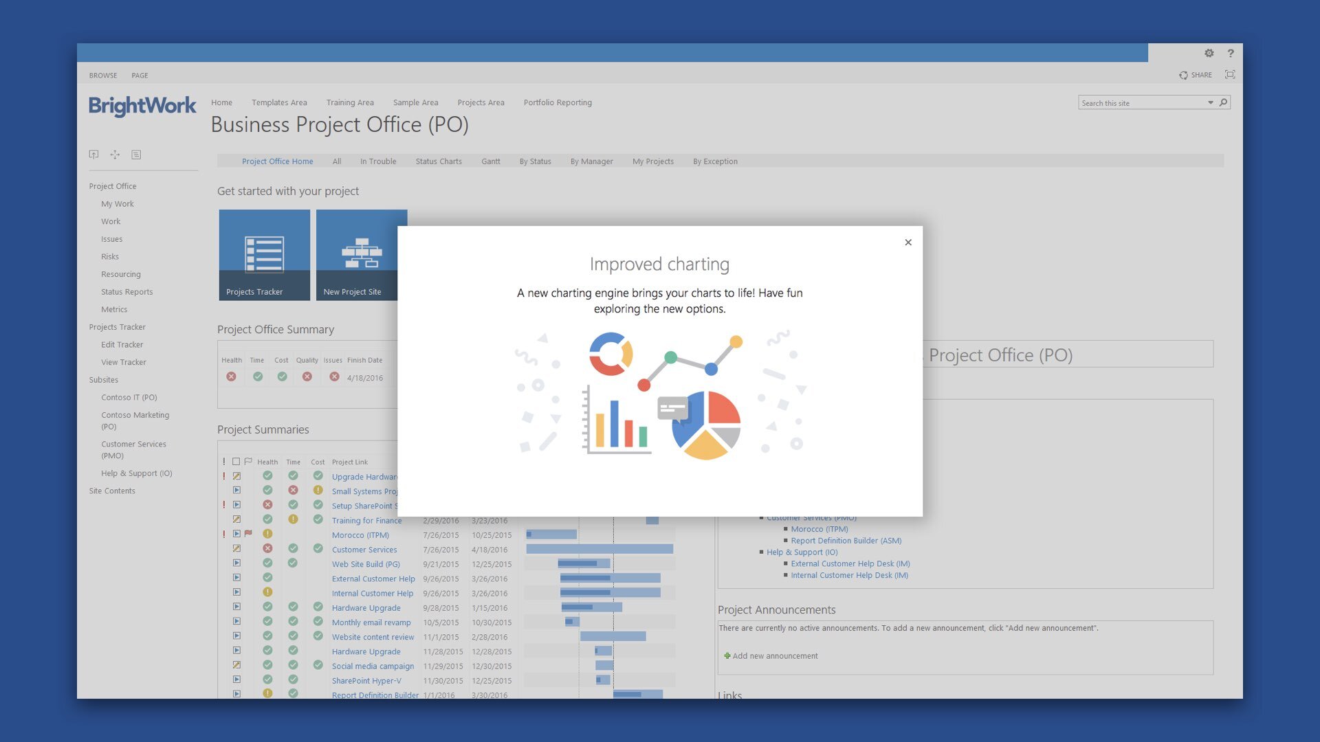
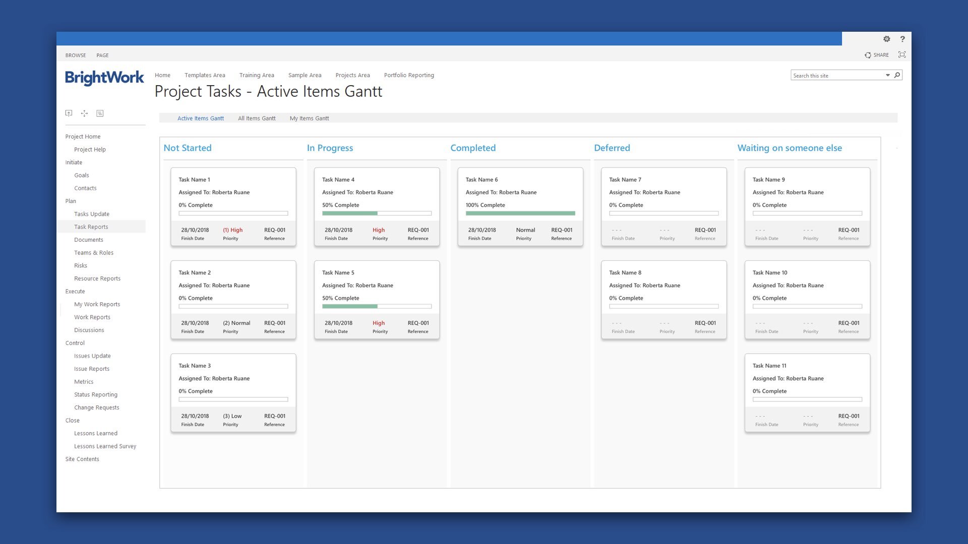
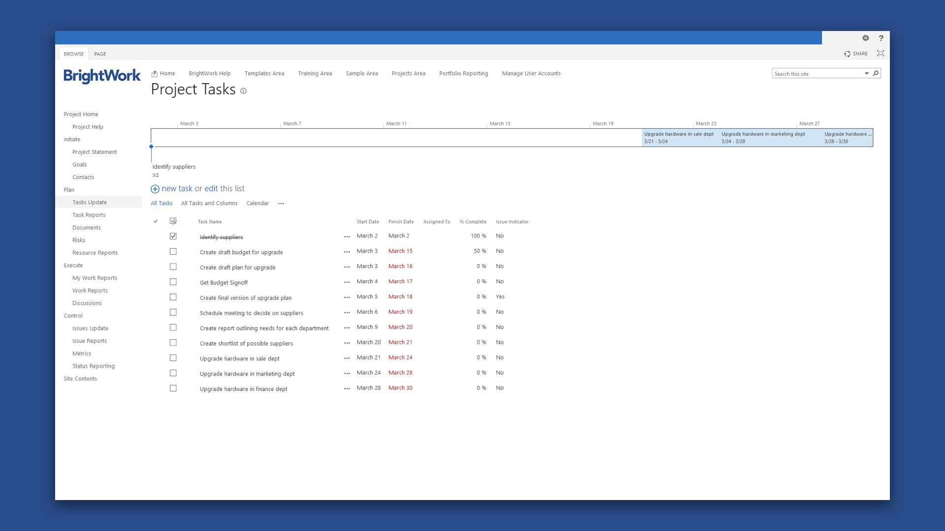
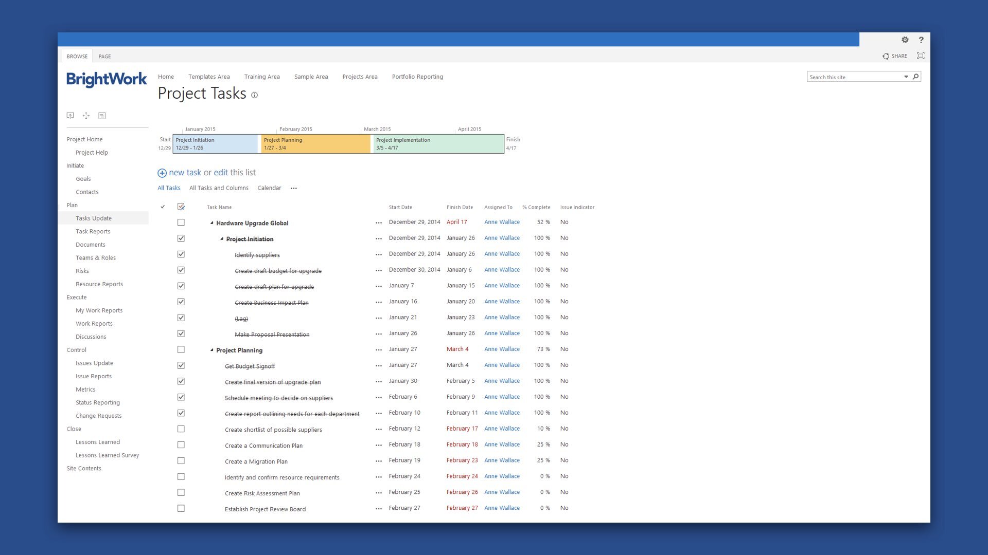
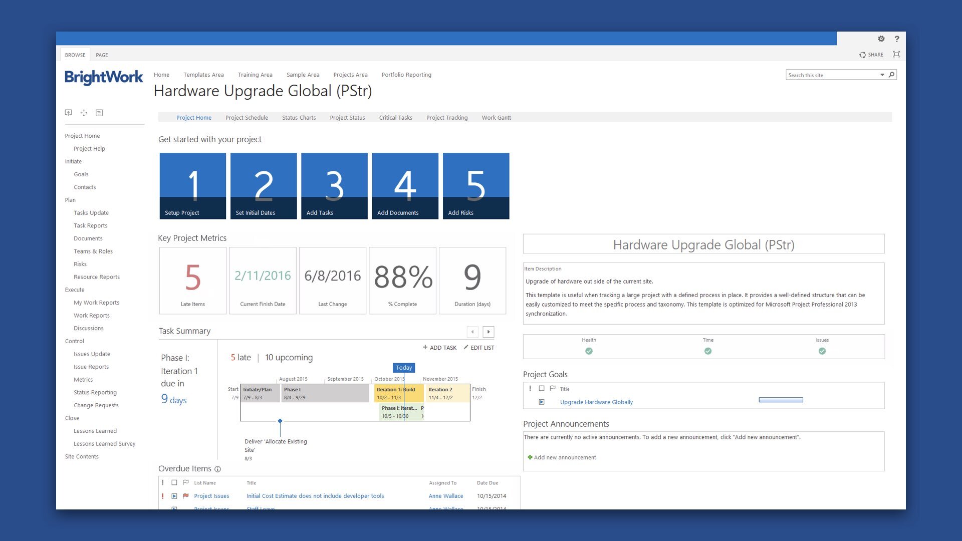
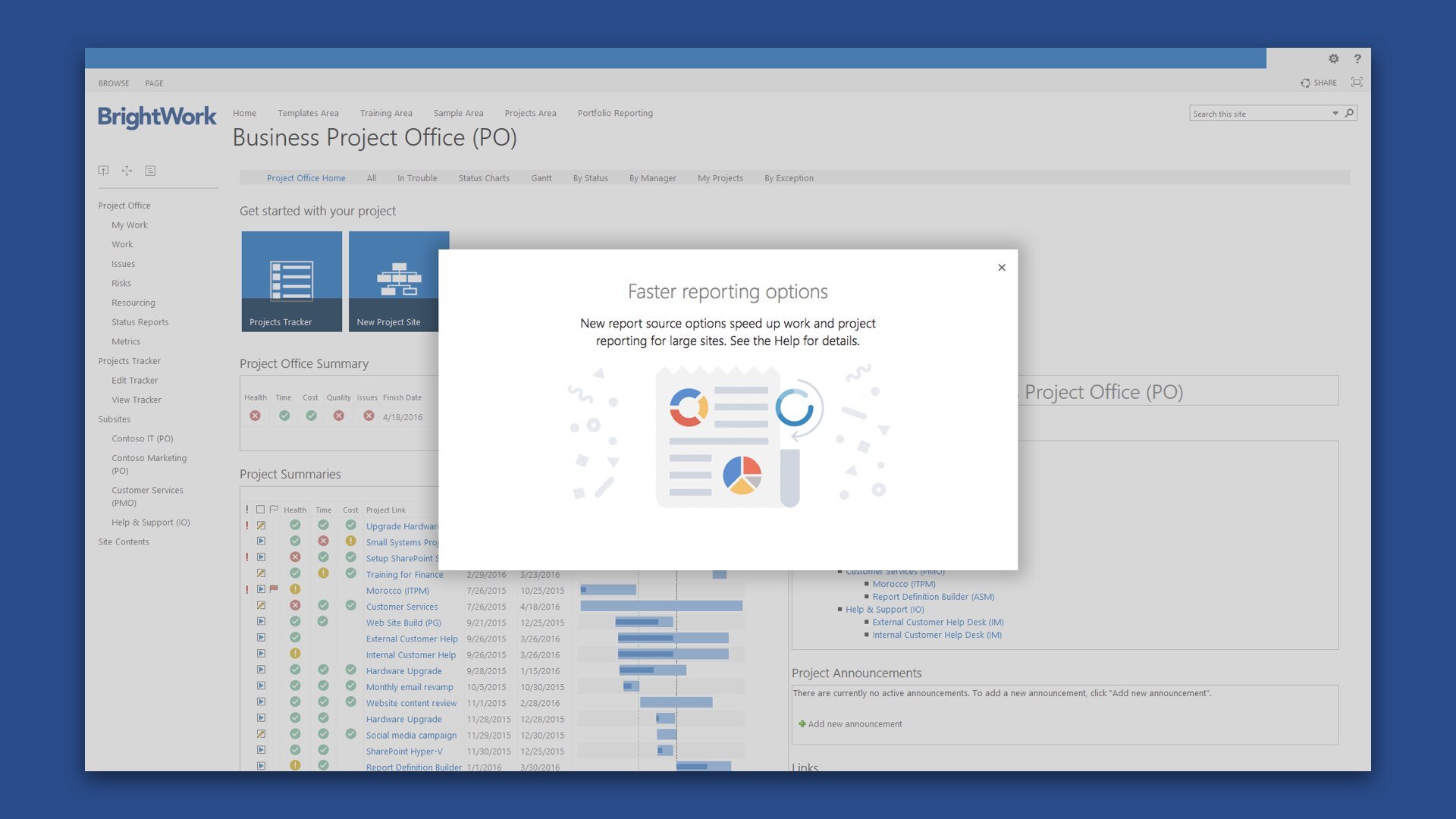
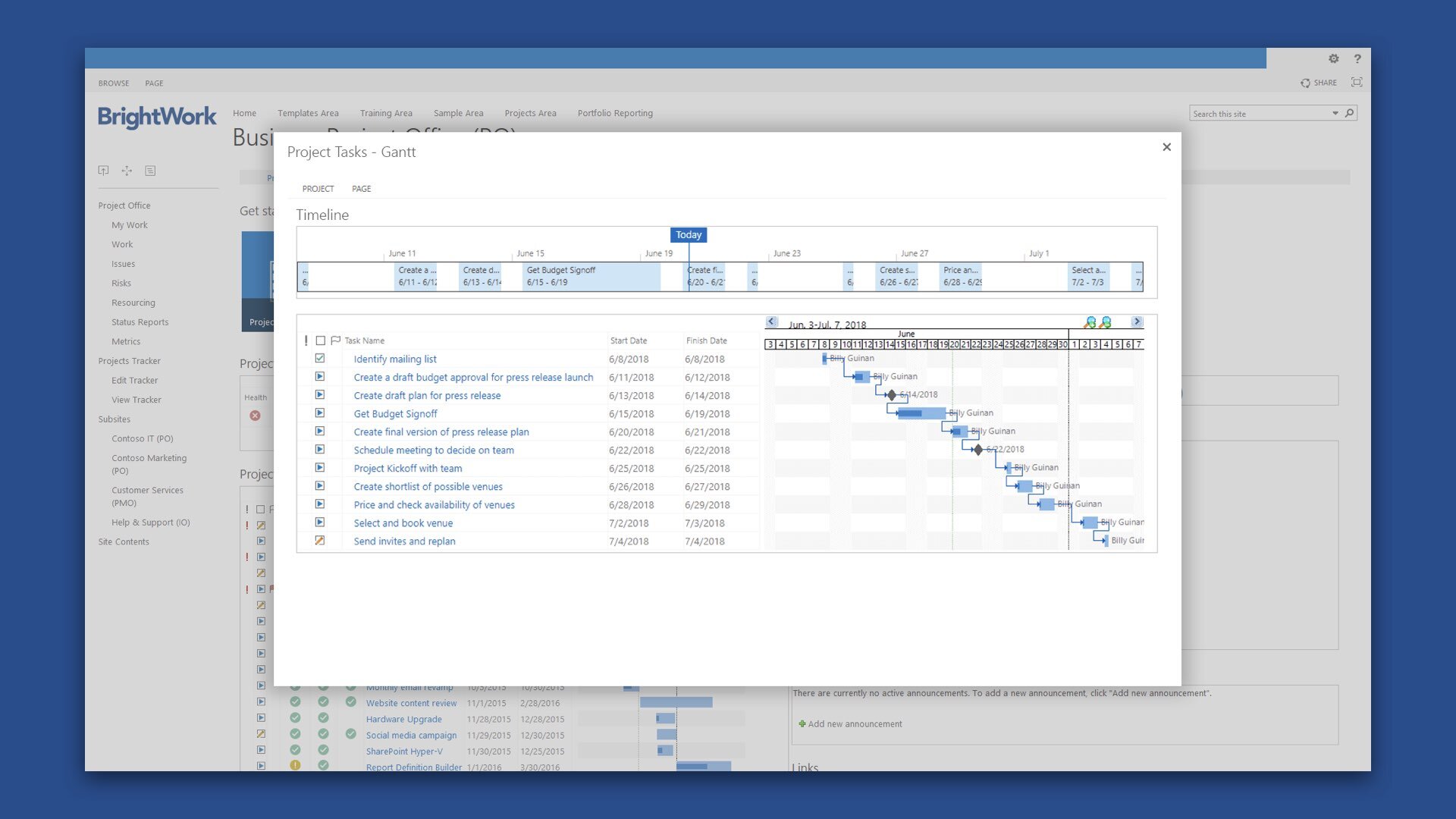
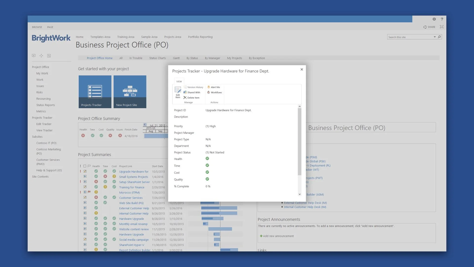
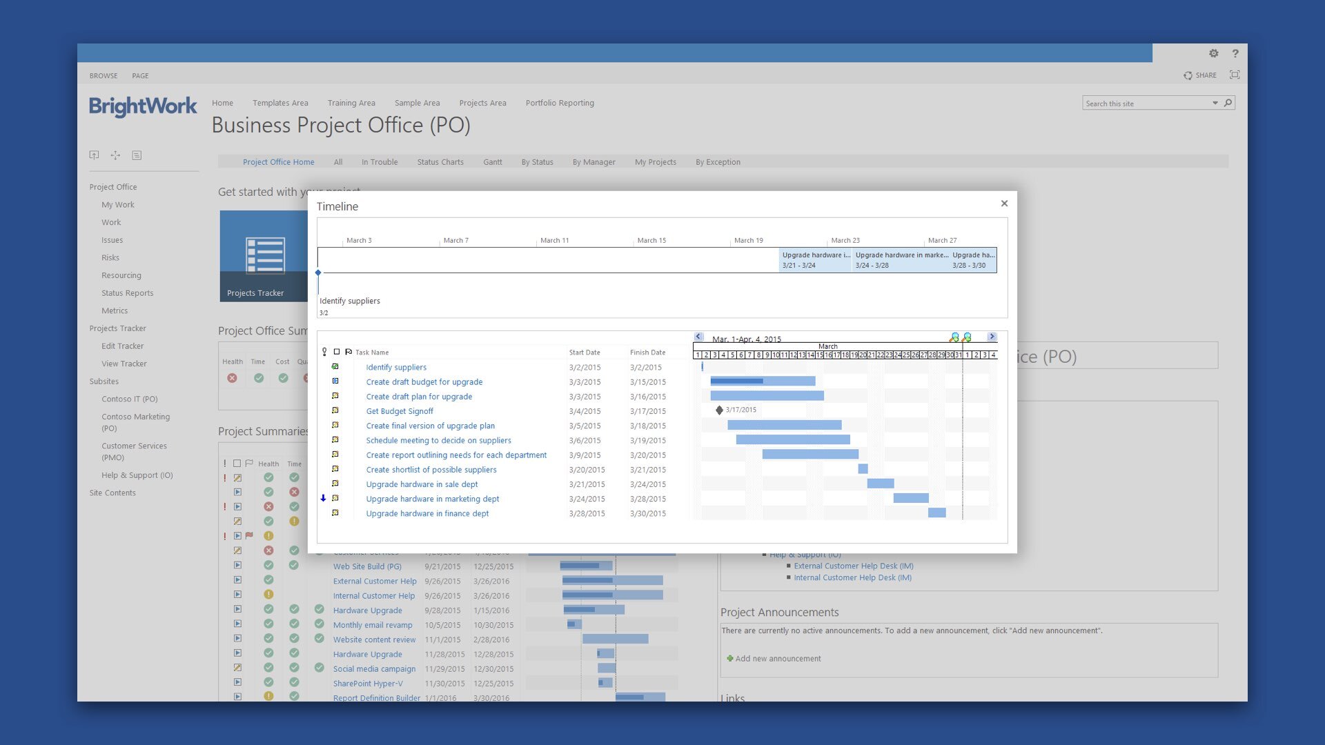
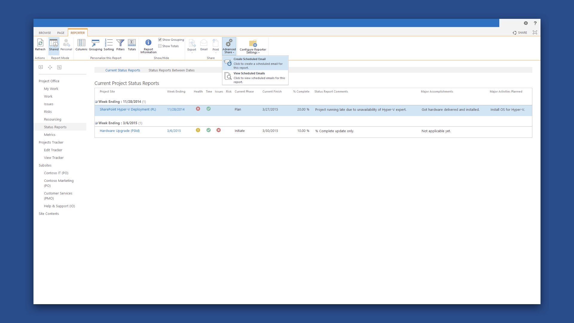
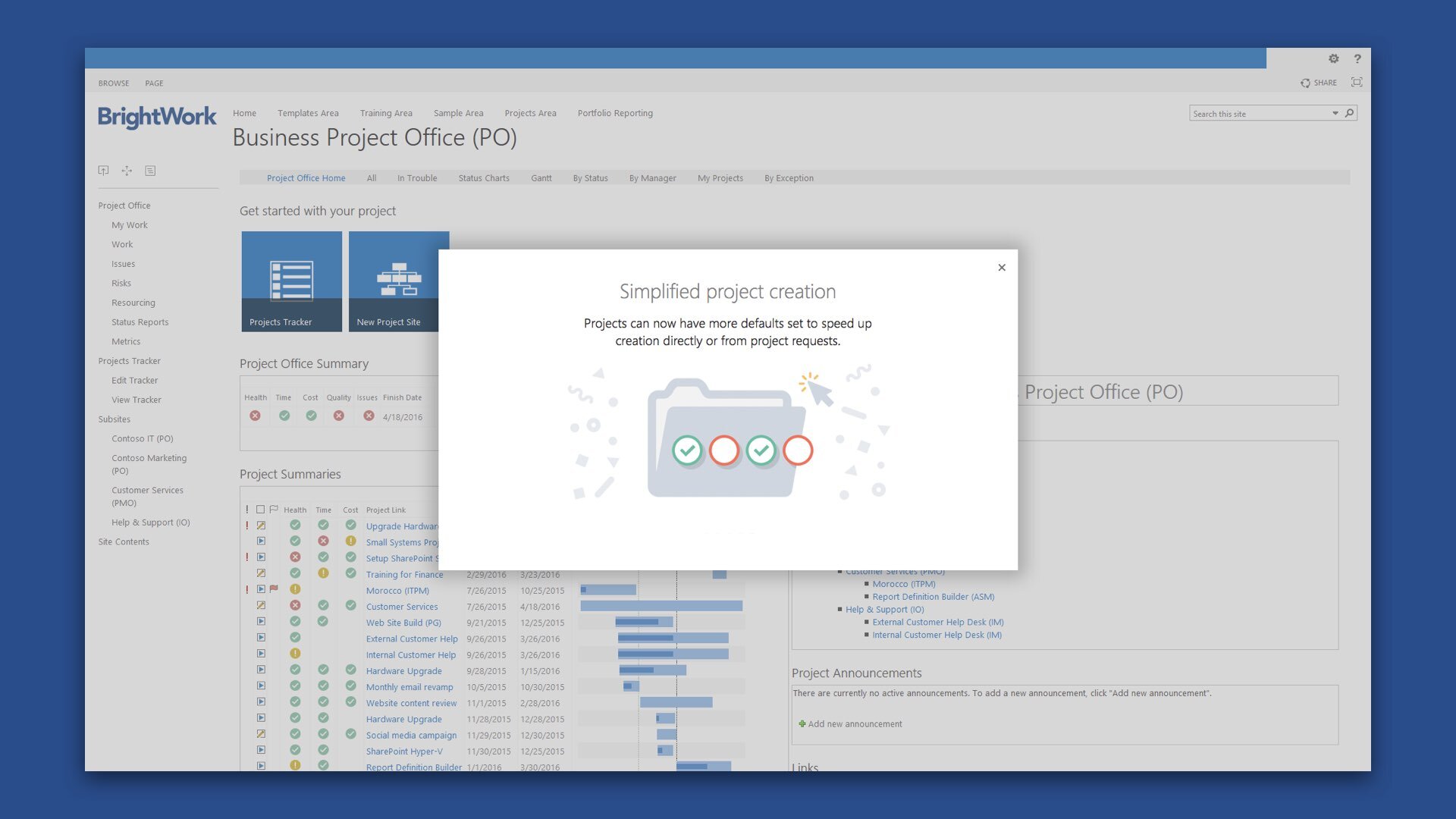
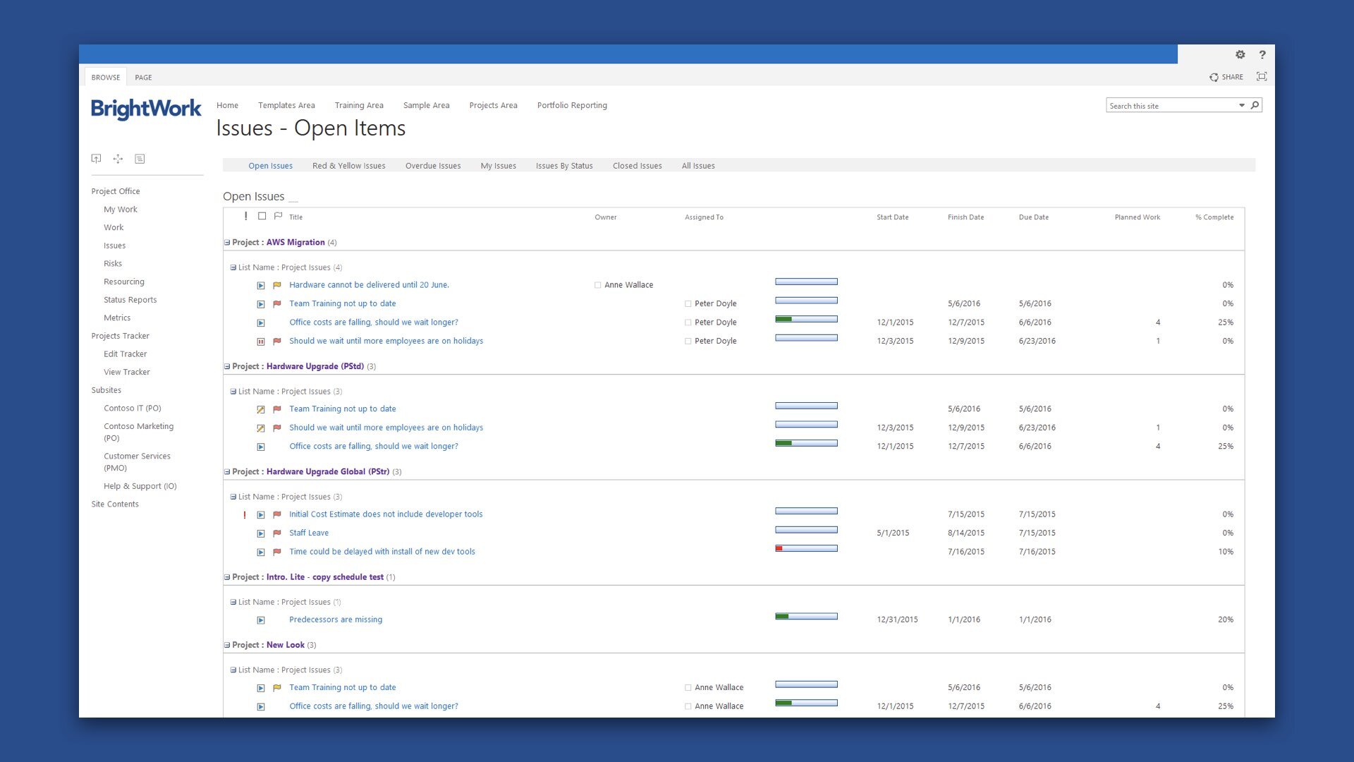
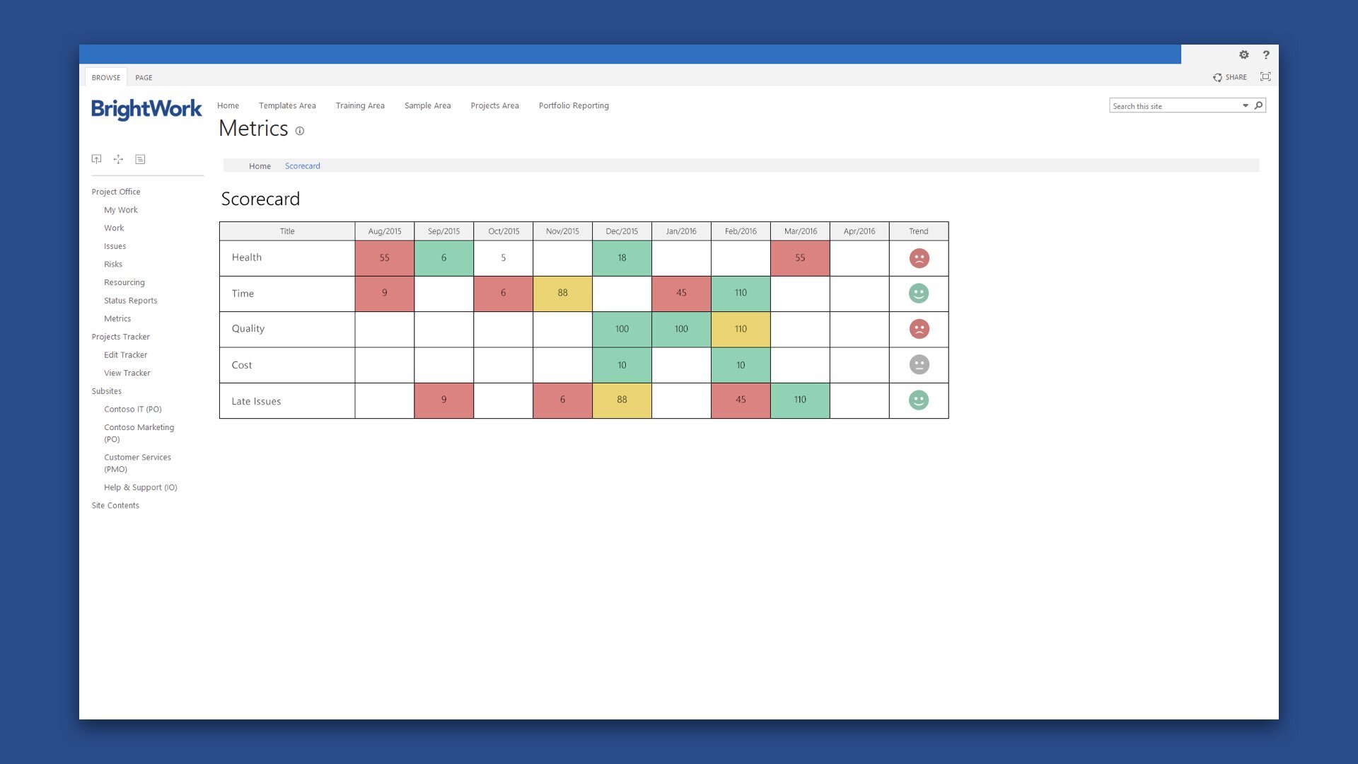
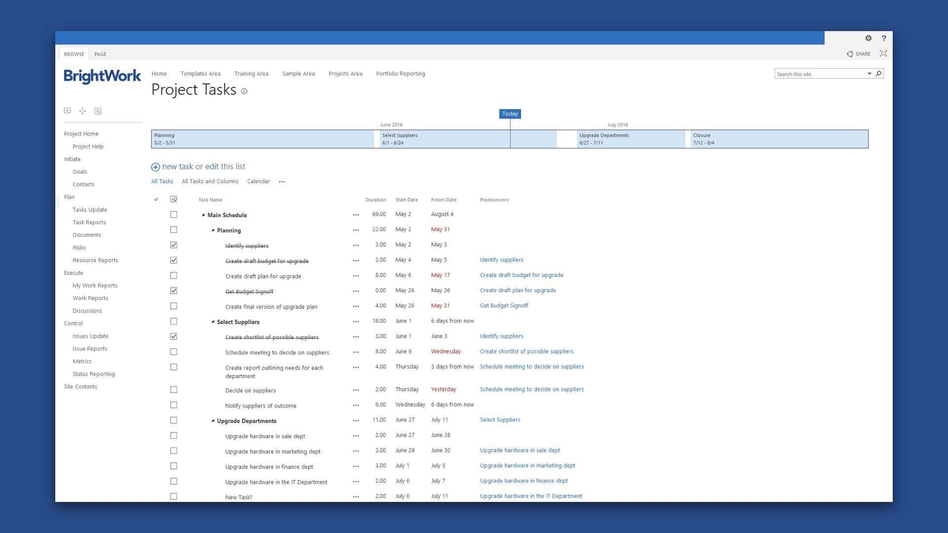
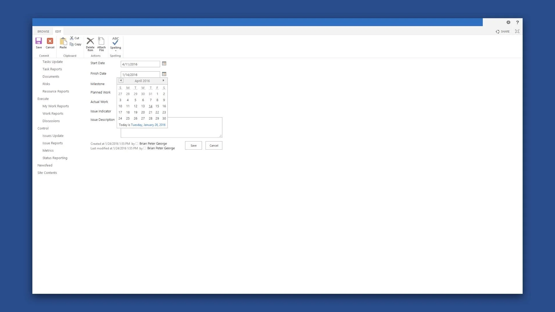
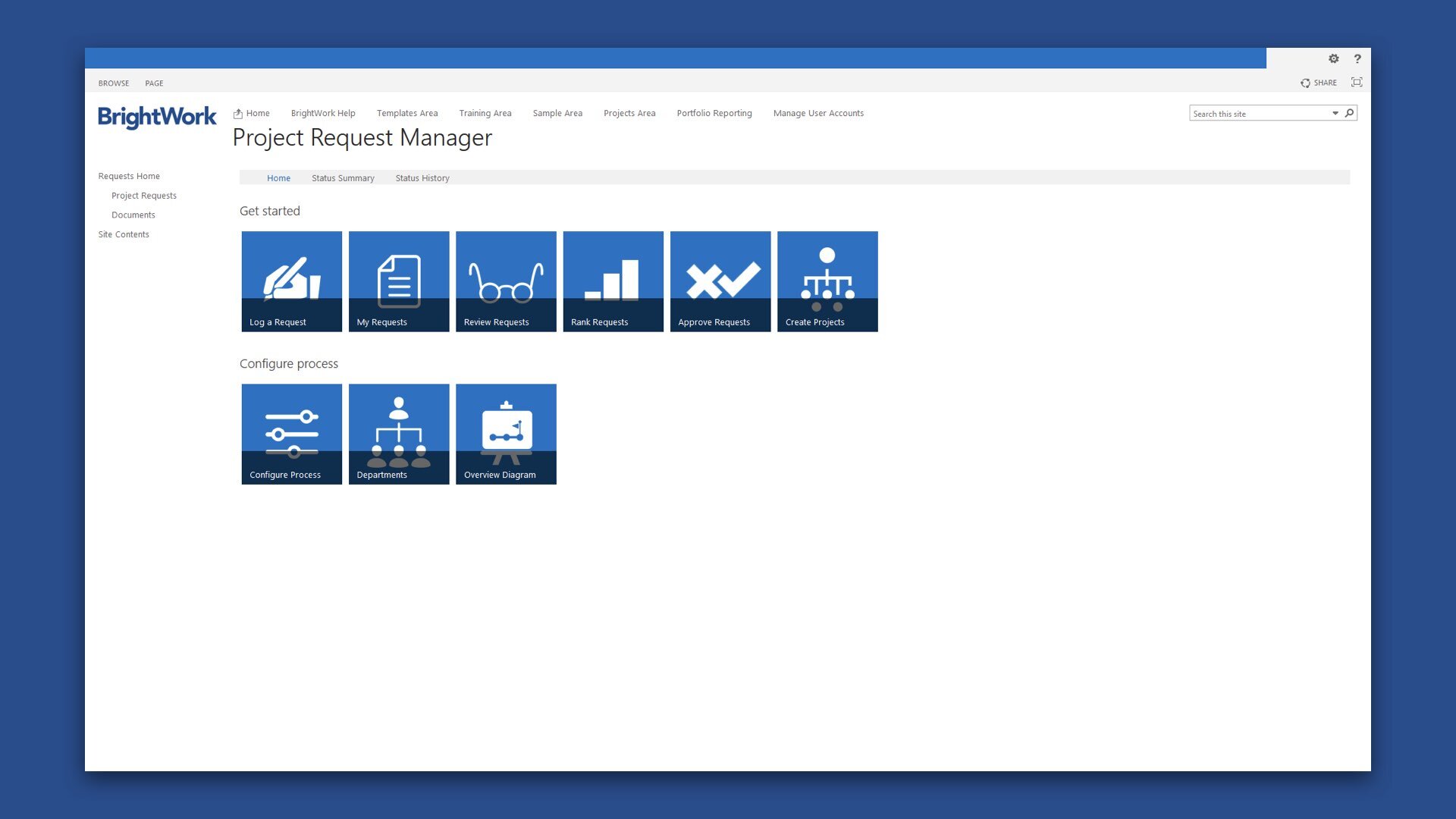
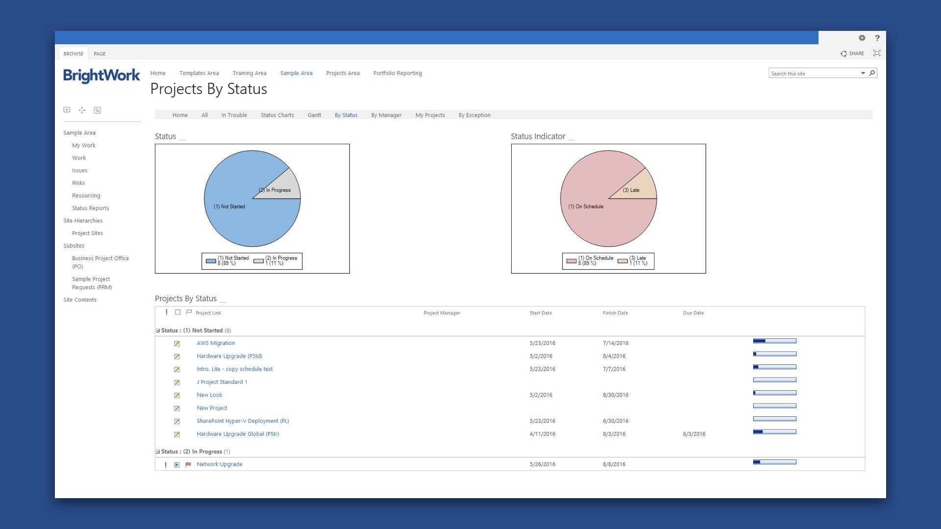
These new product features and enhancements included the following; project request manager, projects and work tracker, fully responsive help, project status reporting, help and guidance, overhauled navigation, improved templates, project task scheduling, interactive metric tiles, scorecard redesign and themes, create project revamp, improved charting component, work cache, project cache, activity indicator, training zone, nintex support, template design sync, scheduled email, project status report cache, kanban boards, copying and syncing workflows, resource allocation, syncing workflows, boards in templates, project cache mapping, boards swim-lanes, versioning compatibility, and user access reports.
What also raised the quality of new BrightWork feature releases was the fact that shortly after joining the product team, I led the creation of a comprehensive set of guidelines in relation to the usability testing of new and existing features. The main purpose of our usability testing approach was to identify usability problems with a new design as early as possible, so they can be fixed before anything was implemented and pushed to production. The usability testing sessions were often conducted on prototypes rather than finished products, with different levels of fidelity depending on the development phase. This also enabled me to test and validate my decisions for the new feature designs by sharing concepts with team members and gathering their feedback.
Usability test sessions were conducted both onsite and offsite with existing customers and various groups of representative user persona types. Tests were conducted repeatedly, from early development up until the release, and features evolved based off the findings in the tests. Overtime, the tests increased the likelihood that the team could quickly craft more successful features in a shorter time. The output of this was an evergreen document that continues to guide our approach to usability testing even today. Alongside a tight-knit team of front-end and back-end engineers, our goal was to rapidly improve the velocity with which the development team at BrightWork could build and learn from it’s users, in addition to creating a shared product design language around the application for future teams to leverage to their advantage. The outcome was a greatly improved user experience for the customer, and a significant increase in annual account subscriptions of the solution.
While working with the Engineering team, we created several future concepts of how the application could look and feel beyond its current incarnation. This undertaking required a deep understanding of human behavior, a perspective on the future, extensive field research, and a whole lot of prototyping. No matter how technology changes, user interface and experience design is still rooted in basic ideas and structures of how humans engage. Understanding core human needs and how people interact with one another is key. Technology may evolve and introduce new possibilities, but human needs are always slower to emerge.
© 2025 BrightWork
