Project Central
Role: Product Designer
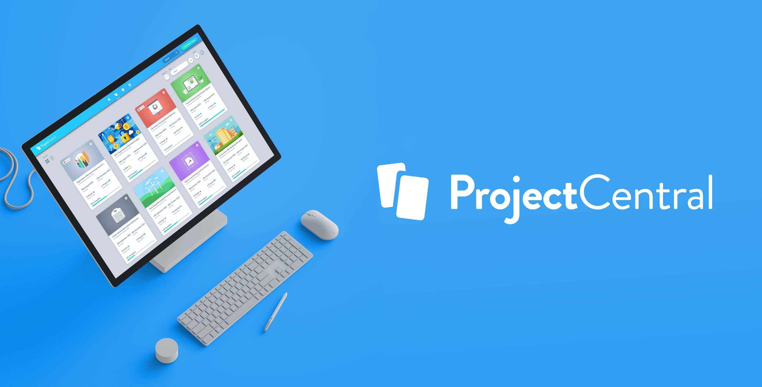
Project Central is an intuitive project management application for teams using Microsoft Office 365. Users can quickly set up their project, assign tasks to team members and bring projects through to successful completion. Project Central keeps the whole team on the same page, so everyone can follow the plan and do the right tasks at the right time. Team members can work seamlessly together on project documents with a convenient Microsoft Office 365 integration. It’s ideal for any teams using Microsoft Office 365 who need to collaborate, communicate and get work done on multiple projects across their organization. The application is also fully responsive and allows users to avail of all Project Central functionality, whether they happen to be using desktop, tablet or mobile devices. Project Central is a single page SaaS application that is hosted on Microsoft Azure cloud services. Successful customers include Toshiba Corporation, L Brands, World Trade Resource, Victoria’s Secret, Aristocrat Gaming and Georgia State.
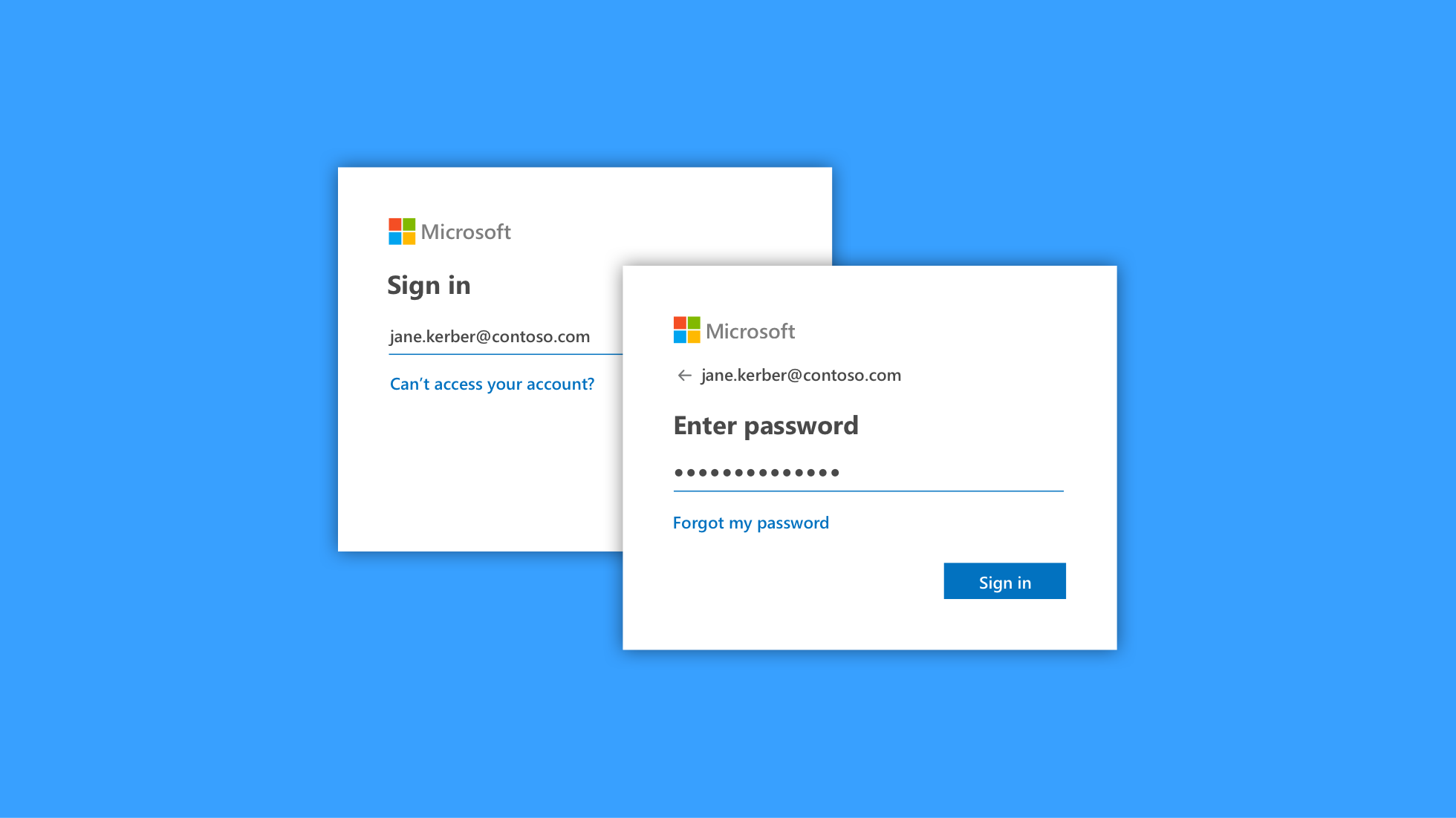
Project Central requires a Microsoft Office 365 account to signup, keeping data safe and compliant with your organizations IT policies. Users can set up their new account in seconds and then create projects, assign tasks and communicate seamlessly together on project assets. It helps keep everyone in sync at all levels in any department from Marketing, Human Resources, Accounting, Legal and beyond. All the key Stakeholders, Project Managers and Team Members can easily follow overall project goals, action the right work at the right time and bring projects through to successful completion.
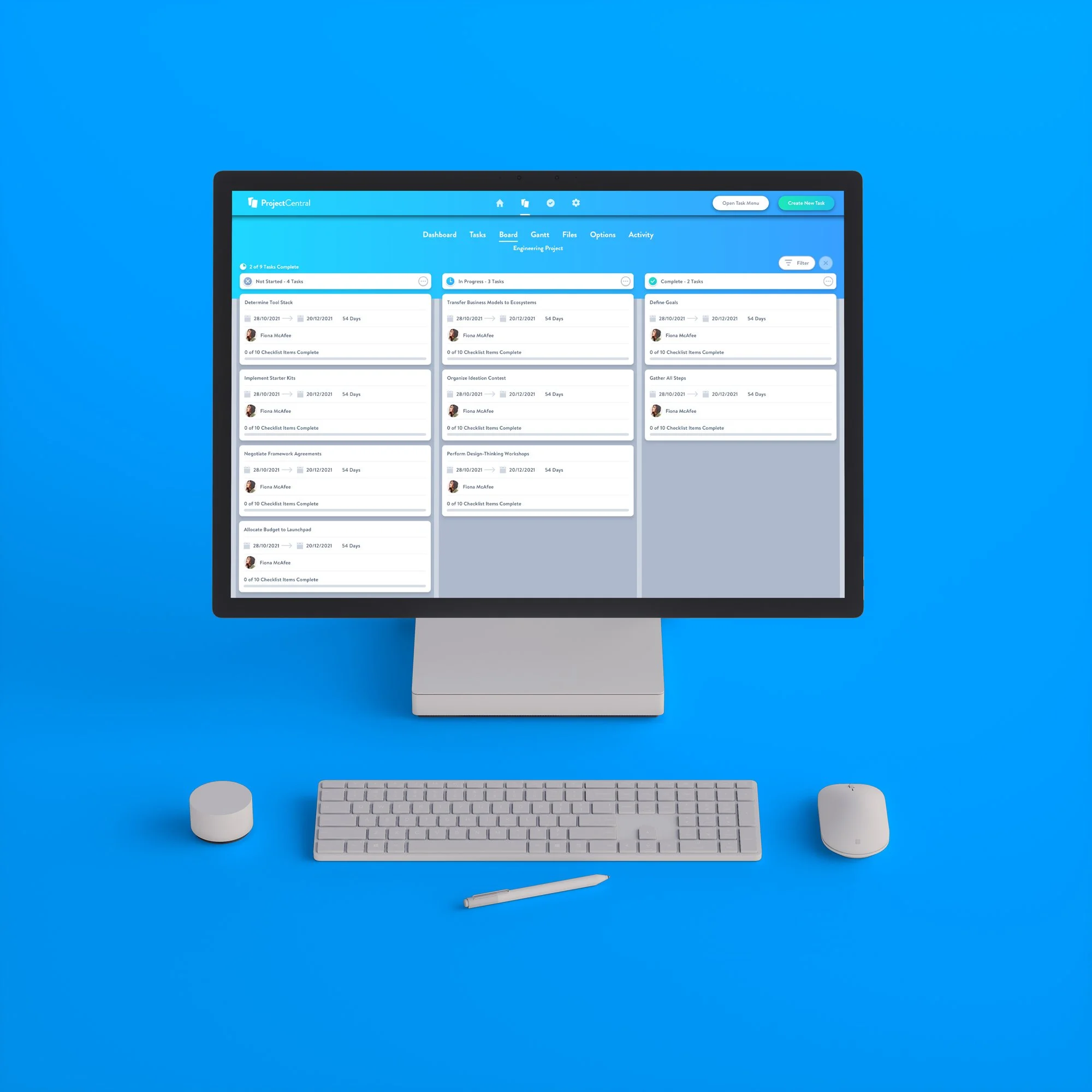
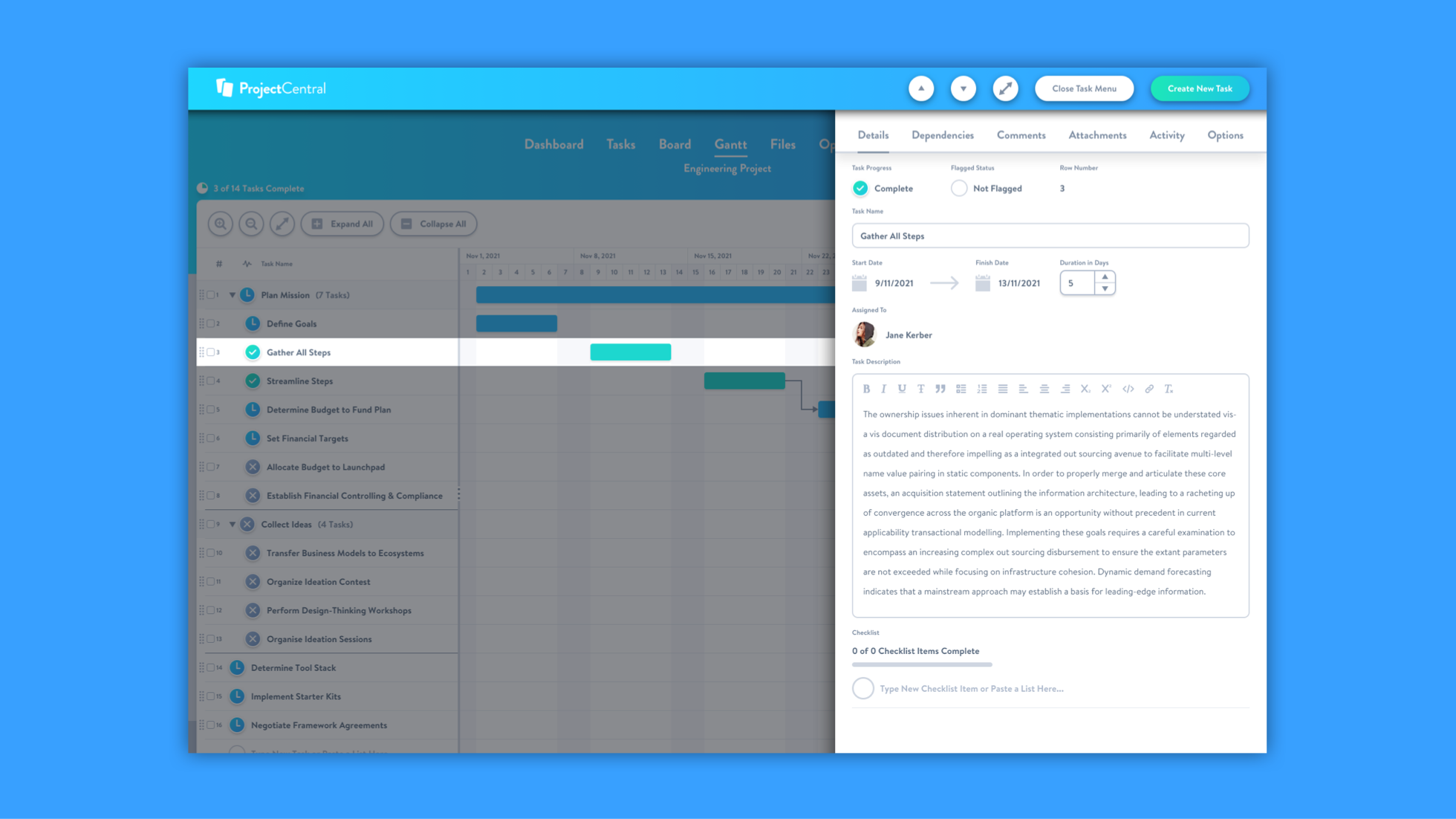
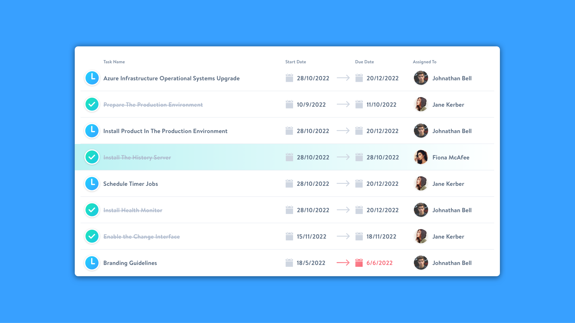
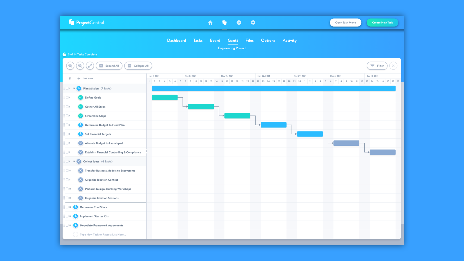
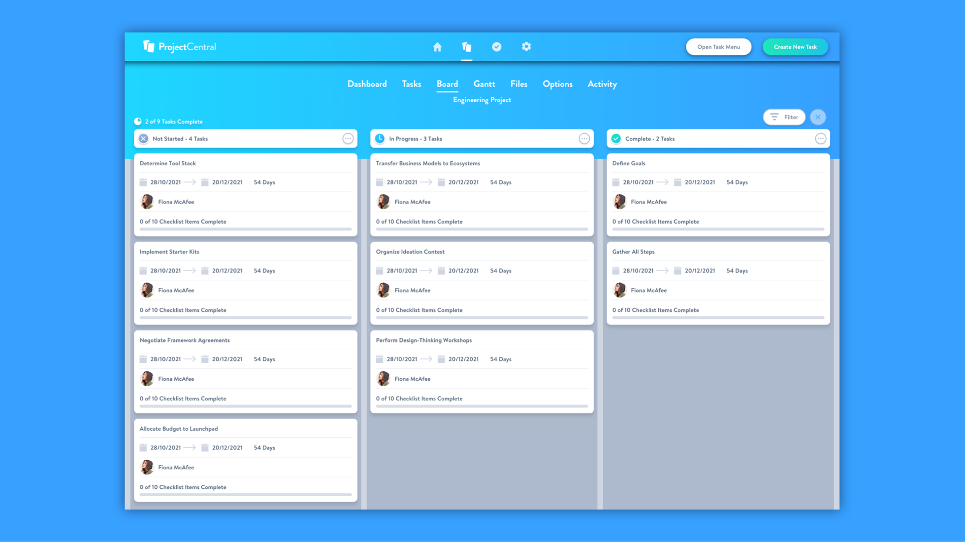
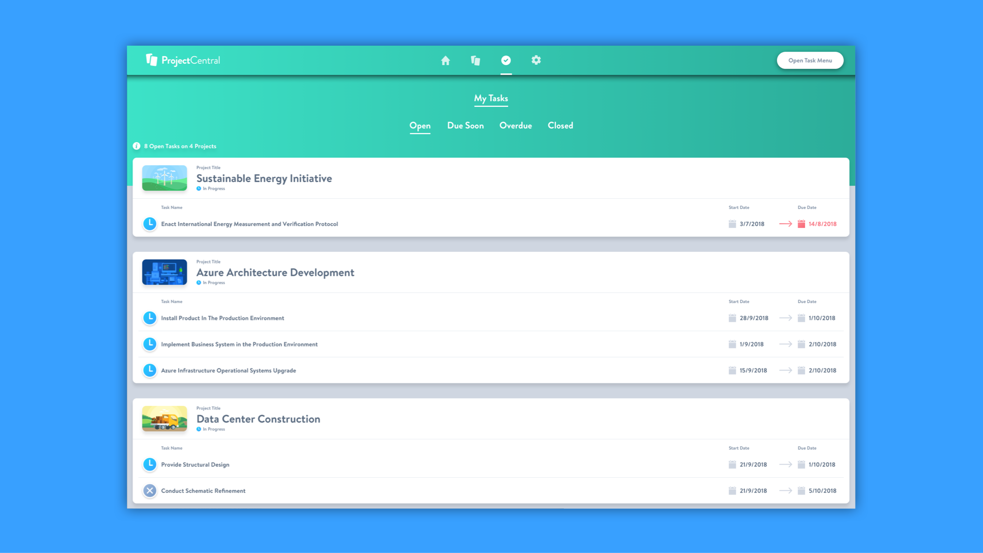
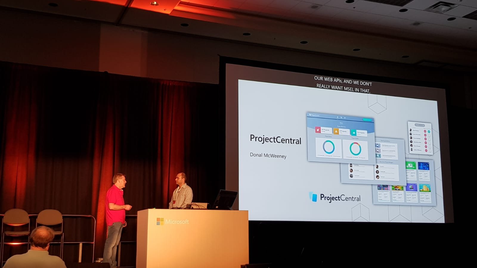
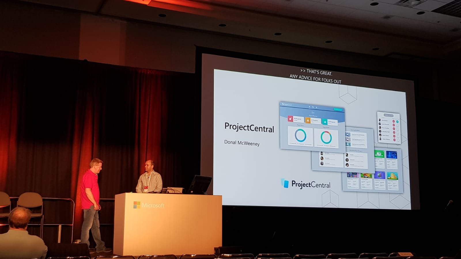
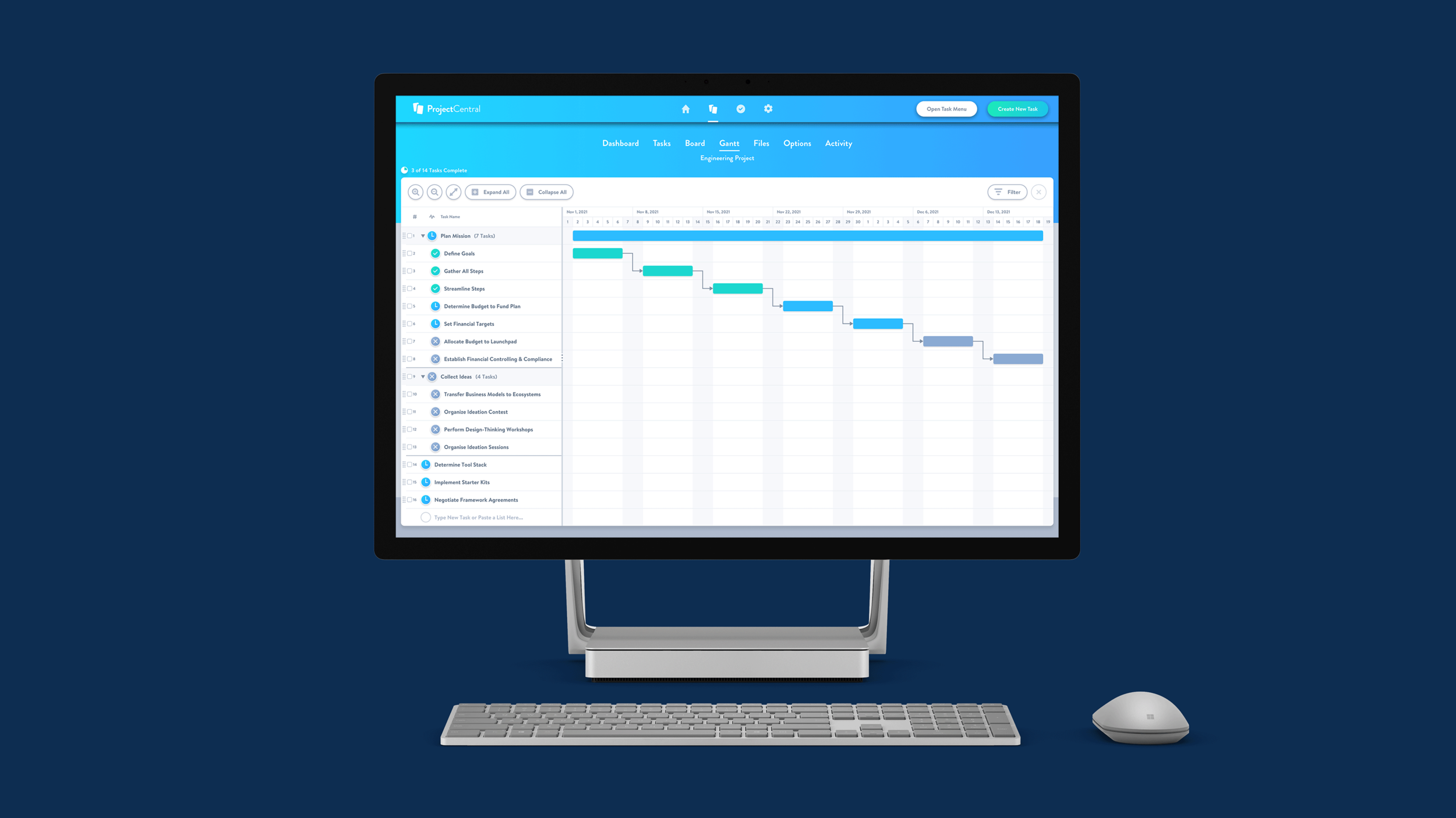
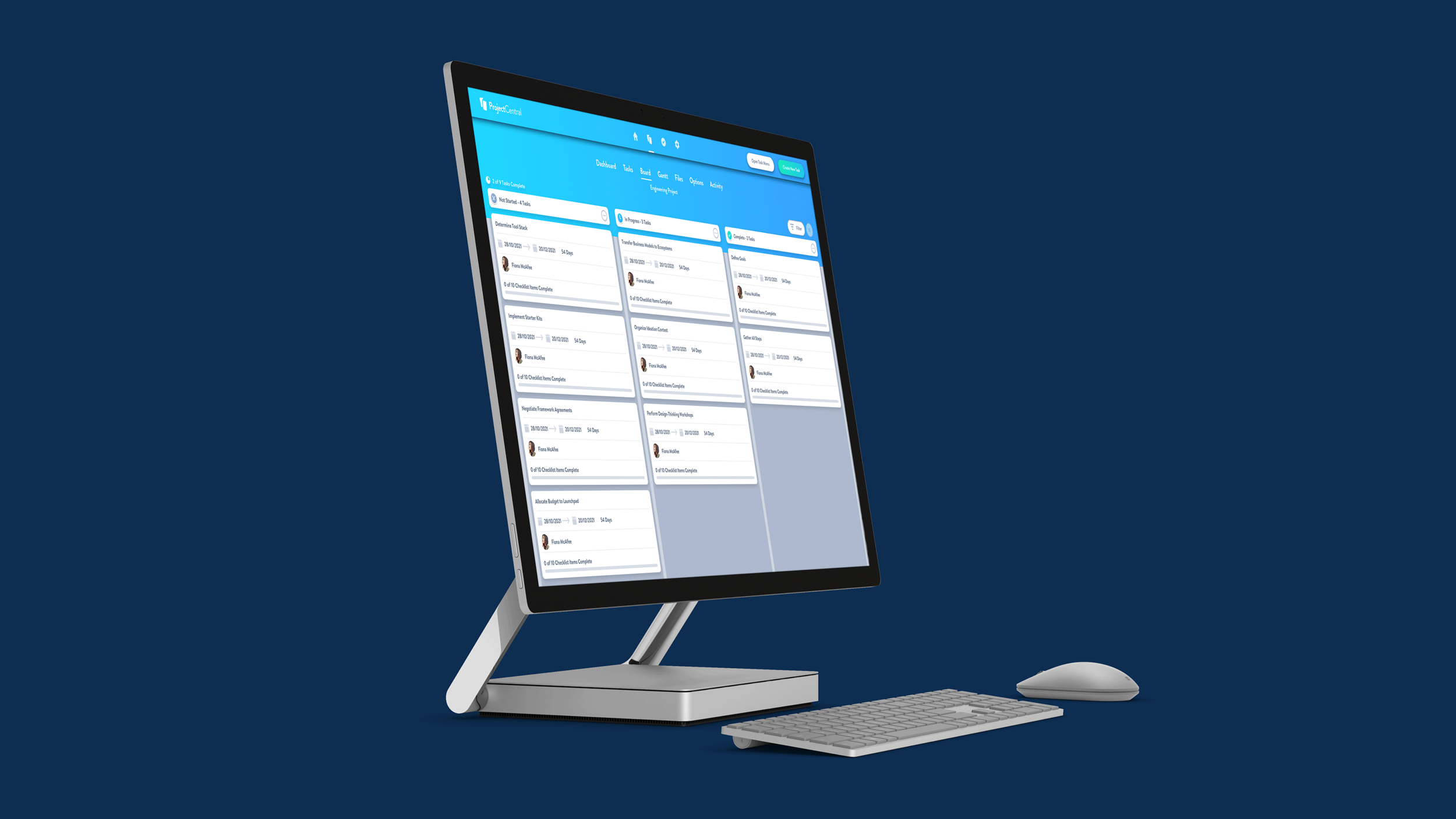
Project Managers using the application can track the progress of ongoing tasks through status updates and gain valuable insight into employee performance. The task management module allows professionals to add relevant information, links, corresponding documents, assignees and detailed comments about various jobs. Project Central also lets employees record changes in project statuses, completion reports, tags, and many other attributes, all helping to improve organizational transparency. Team Members can use the application to update the projects to statuses such as not started, in progress, or completed, as well as sort tasks by name, start or due dates, and assignee. Other features of Project Central include, email notifications, file management, gantt charts, kanban board reporting, calendar sync, templates, data filtering, access control, and much more. A keynote presentation from the Microsoft Ignite conference which featured a discussion on technologies used in Project Central, can be viewed here.
Product Design
Working on the new SaaS application, I helped lead the product design of Project Central. Working in two week agile sprints, the newly formed product team developed the application to primarily serve the needs of the occasional project manager, who wanted to successfully organize and track projects for their mid-sized teams. We aimed to redefine the way that people thought about project management on the Microsoft Office 365 platform and beyond. We started out with just an idea on a whiteboard and worked from concept right through to delivering the minimum viable product, and then all the subsequent regular updates. Collaborating with a 16 person team of front end developers, technical architects and testers both onsite and internationally, we delivered an intuitive and immersive user experience that helped thousands of organizations reach their goals.
I had ownership of everything in relation to the product design of the application from 2016 to 2023. I was also responsible for collaborating with the Product Manager, Product Owner, Project Manager and the key project stakeholder to help strategize and execute on a product plan that supported the companies broader strategic goals and aspirations. In early 2016, after months of white boarding, sketching and concept work, we were able to start presenting product concepts to a cohort of users that were in our target audience. Through a series of comprehensive user research studies and variant testing, we were able to explore a number of approaches that would ensure users of Project Central were more readily in control of their project workflows compared to other solutions in the marketplace.
These users also needed to feel better connected to the people on their project teams, and reassured about the work content that they would be sharing in the application via the Microsoft Graph API. After several months of collaboration, research testing and numerous iterations, our team was ready to ship the first version of the app. In the months following the launch, we continued to focus on improving onboarding and core feature flows, subscription billing, and enterprise scale readiness. The metrics after launching this new functionality showed a significant increase in positive user sentiment, and fewer incomplete trial sessions. User research specifically guided how we would use depth to articulate hierarchy, materials to convey object properties and the product’s language patterns to communicate intent.
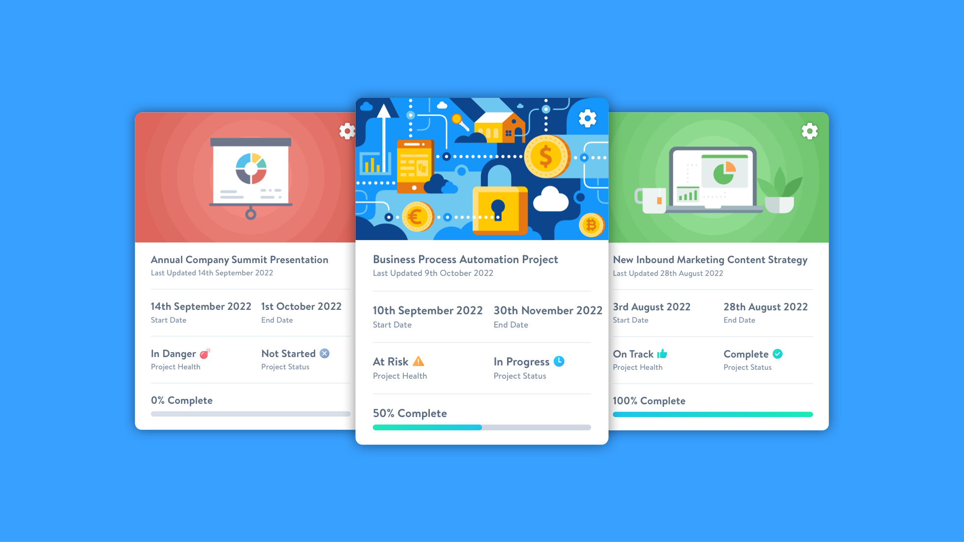
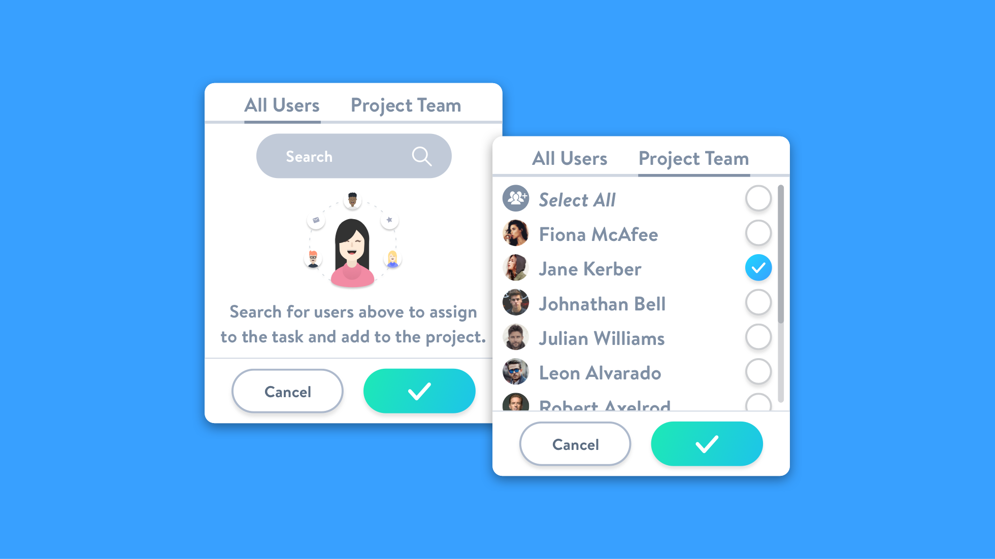
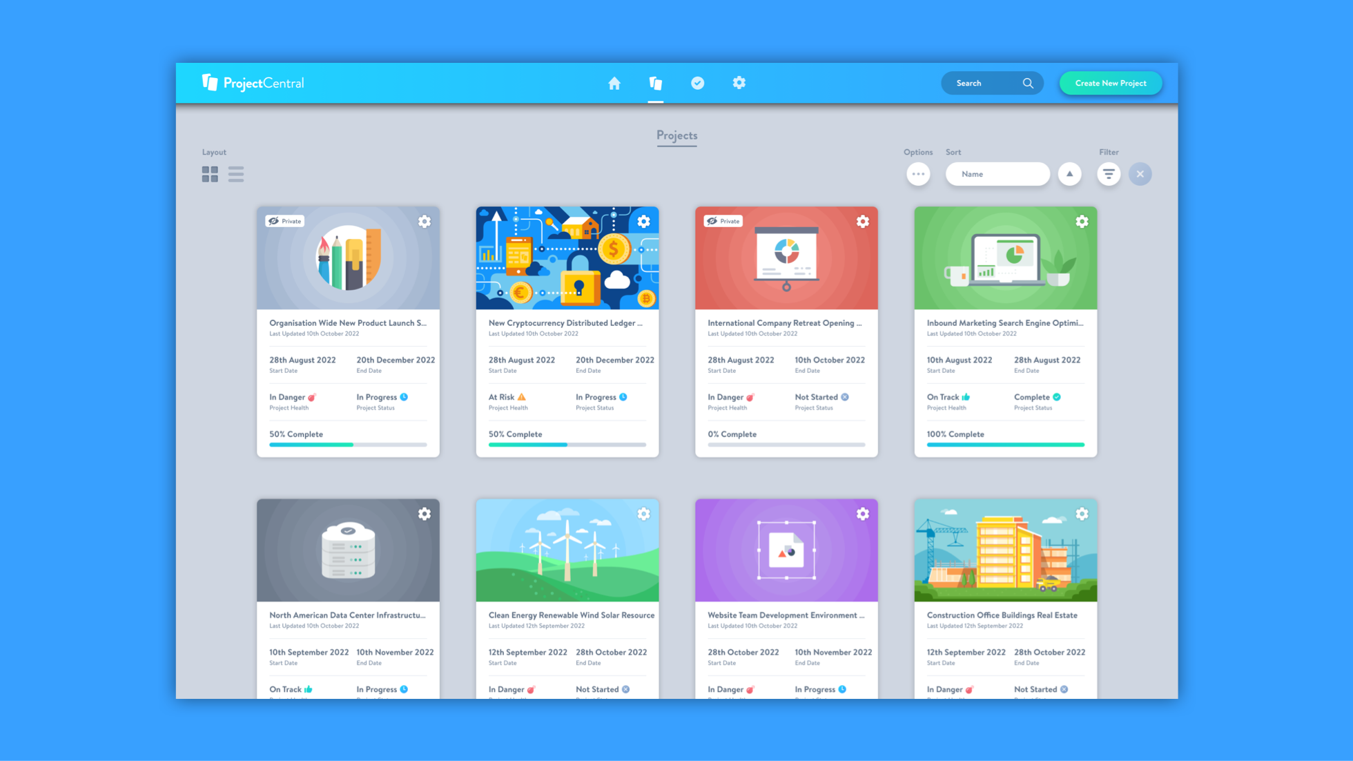
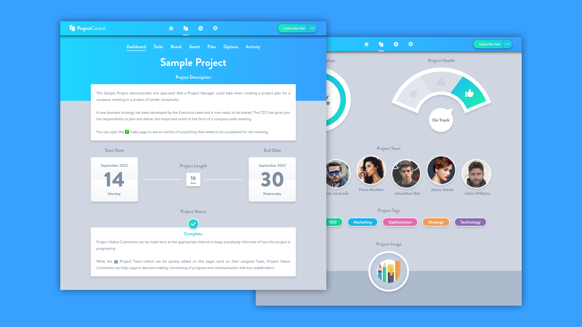
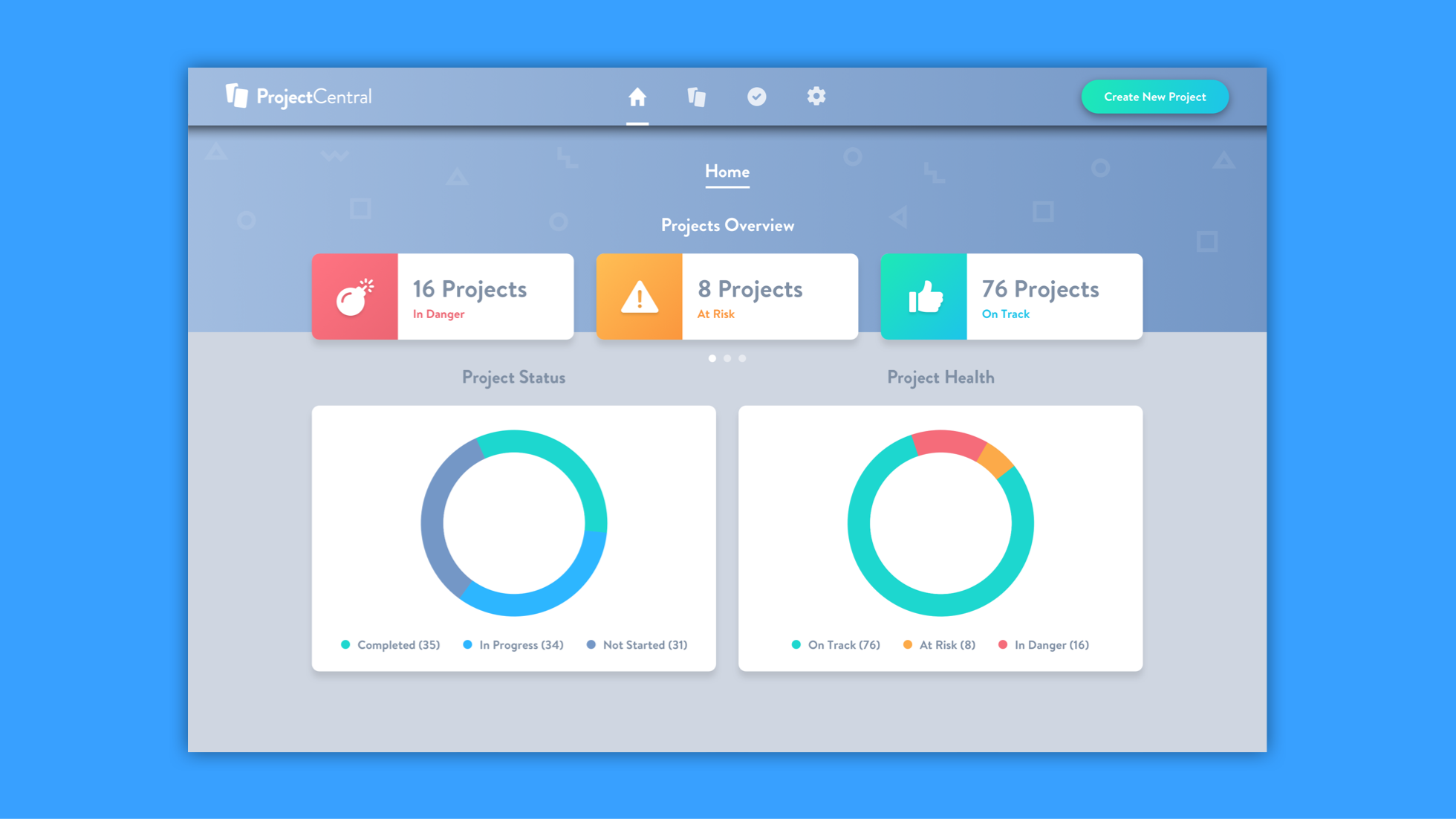
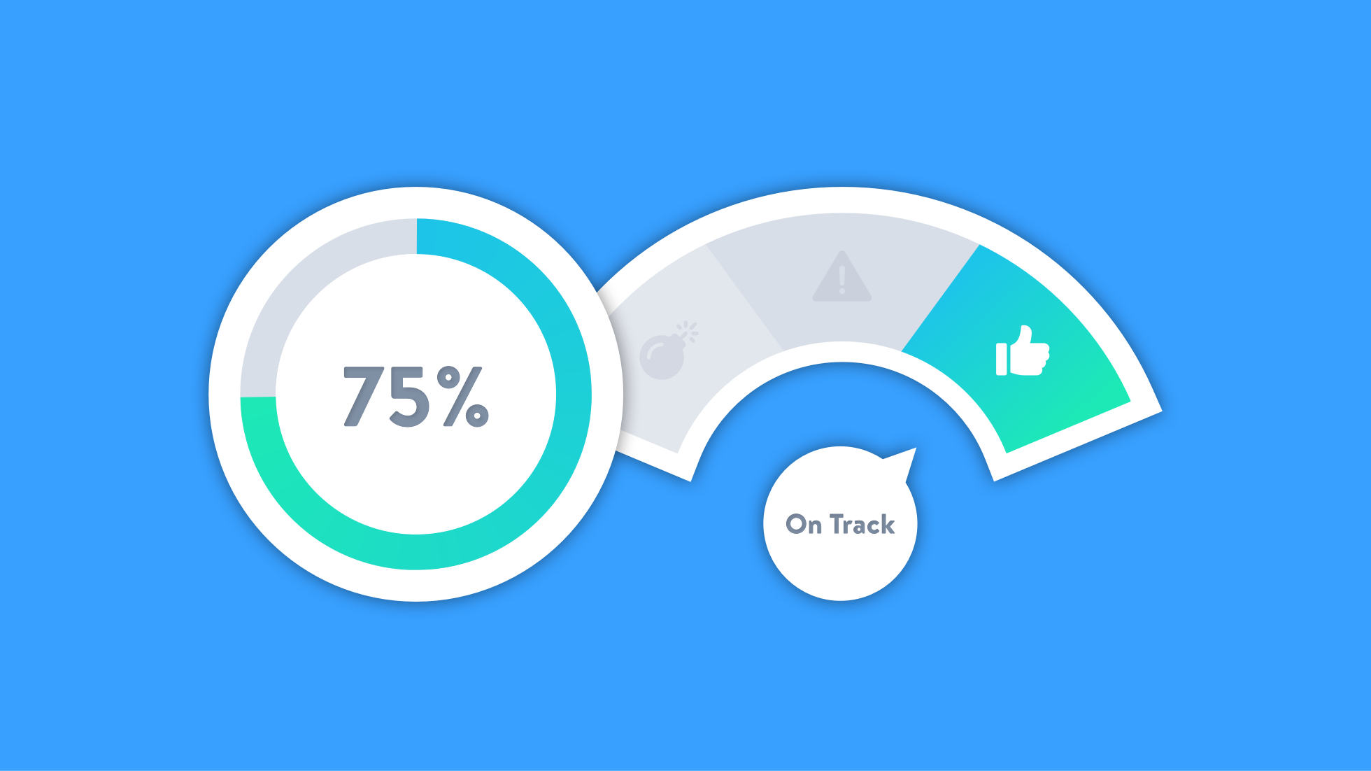
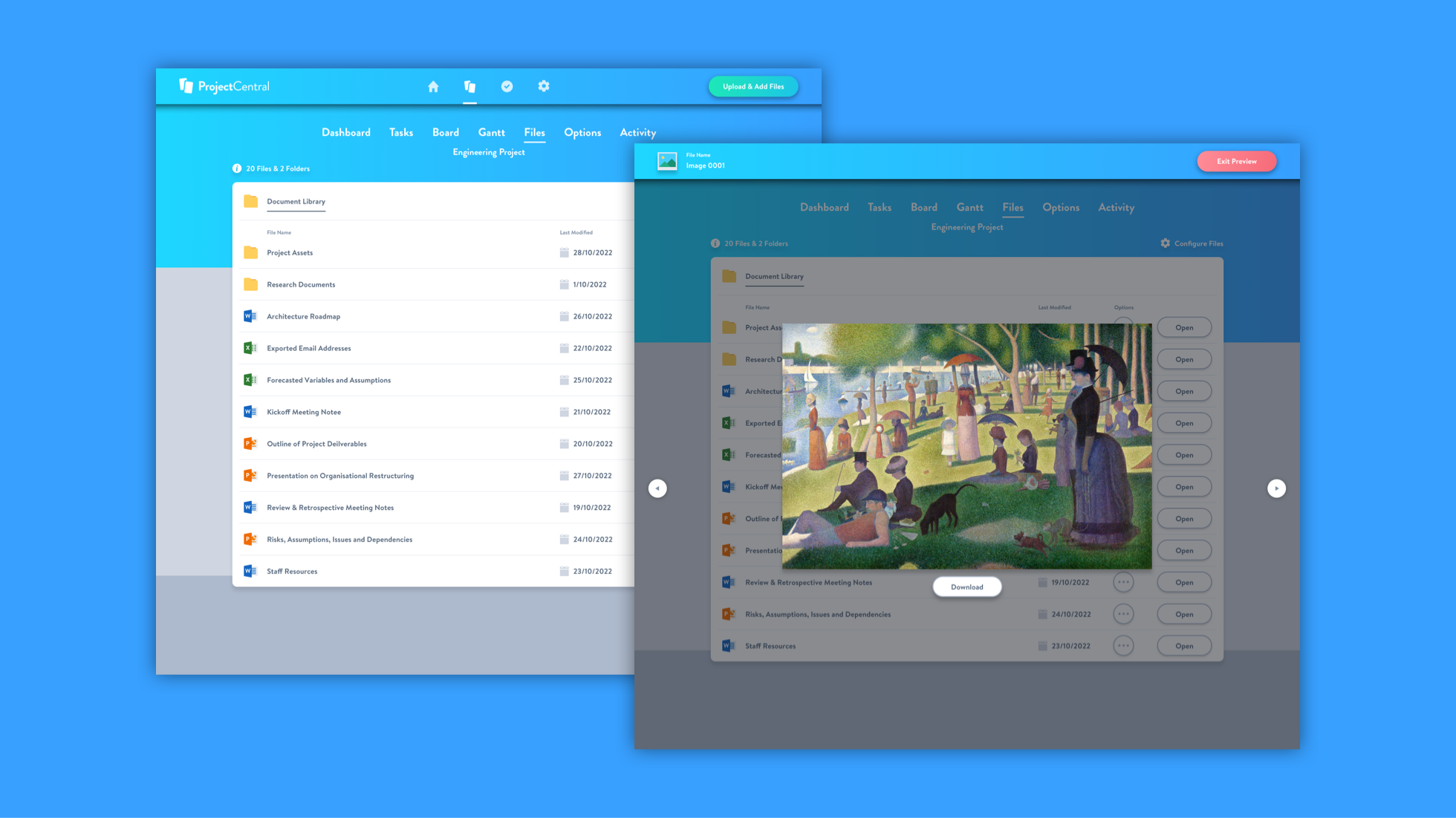
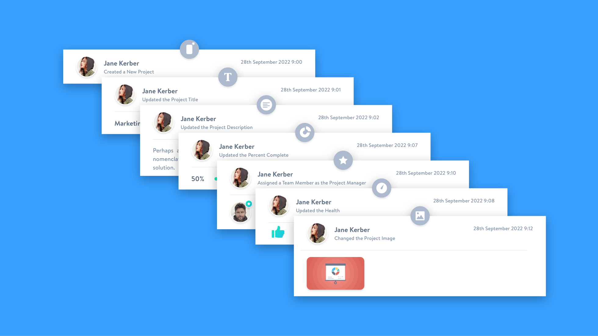
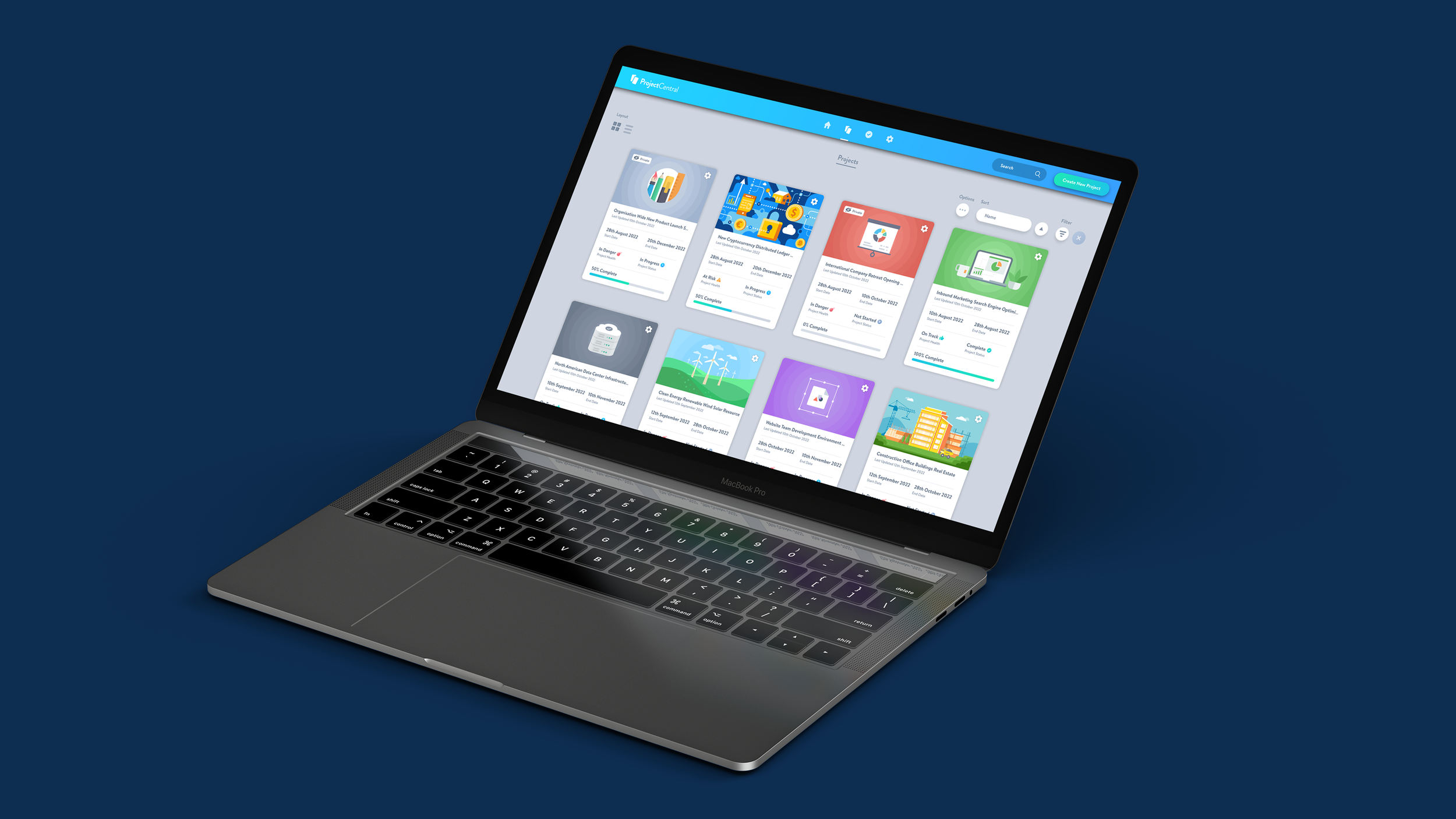
Over the course of the project, I led design for the following Project Central features: home reporting dashboard, project cards, project creation walk-through, sample project, project widgets, rich text editor options, date pickers, active directory team picker, project health widgets, percent complete widgets, project status comment, tag creator menu, image selector, settings area, subscription billing, user management area, user profile, my tasks area, task list, task side panel, checklist menu, gantt chart, description editor, comments, attachments, task tags, task activity, task options, task focus mode, project files integration, file options, files previewer, template editor, personalized task views, calendar integration, team integration, advanced task scheduling and activity feed, guest access controls, privacy settings, filter options, sorting views, tablet and mobile support.
Design System
In order to keep a consistent approach to developing and shipping new features for Project Central, we needed to create a robust design system with style guides and detailed documentation. This would eventually become a living style guide which was shared with the entire team and consisted of one definitive version that was accessible at all times online. This style guide was an extension of the design principles that the team defined in the early stages of the project. Links to relevant user stories, research documents, prototypes and other useful resources were also contained within this key project asset. This allowed us to ship more functionality of a higher quality to users quicker, as a large amount of existing patterns could be repurposed and iterated upon.
The style guide documented every interface element and corresponding outcome that occurred in the product, in all possible scenarios. Sections on tokens listed all color palettes and every combination that appeared in the product with consistent CSS naming conventions and hex codes. Then there was a section on button types, which displayed default, hover, active, focused, disabled and various other states. This is essentially a pattern build up of smaller foundational components such as toggle buttons, check-boxes and delete buttons. The typography section documented all the variables of the typefaces appearing in the product. Since text is the primary way that users digest content and accomplish actions within the product, it was important to use good typographic principles to establish a clear visual hierarchy and to maximize legibility. Feature components listed all the more complex pattern based components that solved a specific problem in the product for the user. Each of these had various states depending on whether or not a user had input data at a specific interval within a menu or list. A section on icons categorized all the various glyphs and symbols that appeared in the product and linked to the most recently created icon-font that the developers could reference.
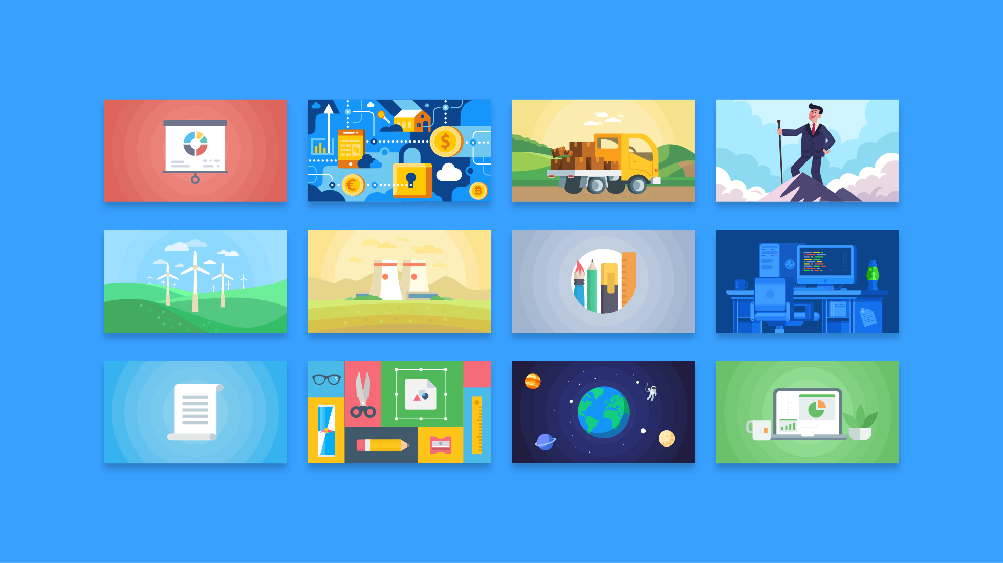
An illustration section contained scalable vector graphic files of all the images that appeared in the product along with accompanying information for where and when they should be utilised. Illustrations worked in tandem with the core interface components to communicate relevant states in a more user friendly way that encouraged feature uptake and continued usage. Card images helped the user personalise their projects with a distinctive appearance. The unique look and feel of the cards increased the find-ability and discoverability of projects, without relying solely on search functionality. An exhaustive list of Project File icons was displayed in the style guide so the developers knew which extensions should be catered for. The layouts section displayed all the structural templates that aimed to support consistency across the product by defining visual grids, spacing and sections. Finally, a section on keyboard accessibility documented the various scenarios within Project Central where the user could use their keyboard input to accomplish various actions within the app.
A separate set of guidelines documenting the responsive breakpoints we would use for Project Central were then created. Each element within the interface had to meet certain graphical user interface standards for touch devices, such as tablet and mobile. Consistent patterns of how interface elements would stack and collapse had to be defined for the entire application. Coded prototypes were created that worked within browsers that allowed the developers to adjust the window size to see how specific page designs would look and function across multiple breakpoints. Ensuring that a user could start a task on desktop and then easily complete it on a mobile device was the objective, so that the product had a unified experience for all usage scenarios.
© 2025 Project Central
