Element Wave
Role: Product Designer
Element Wave is an innovative mobile user engagement and customer retention platform for the app market. It helps iOS and Android app publishers drive greater mobile revenues through advanced push messaging technology, geo-targeting and real-time analytics. Element Wave is designed specifically to create real-time mobile engagements. No other platform has the same focus and dedication on fostering real-time mobile engagement. Not only is it a push notification service, it also specialises in real-time APIs that deliver contextual, personalised, event-triggered messaging that increases loyalty and tackles the issue of user churn.
The platform can deliver up to 100,000 notifications per second which makes it the fastest mobile marketing automation platform in the marketplace. This robust speed ensures a brand’s call-to-action is in front of it’s ideal customer 10 times faster than competitors such as Airship and Mixpanel. Element Wave’s powerful automated and personalized mobile Customer Relationship Management platform for iGaming also delivers 10 times more in-play bets. In 2017, global research and advisory firm Gartner, named Element Wave as a leader in their annual Market Guide for Mobile Marketing Analytics.
The list of customers that use Element Wave to increase their app revenue and engagement include RTÉ, Ericsson, The Gaelic Athletic Association, Irish Greyhound Board, The Solheim Cup, Ladies European Tour, Sage, GVC Holdings, ActiveMe, Betsson, Bwin.Party, Digital Entertainment, Kroon Casino, Betsafe, Casino DK, Sportora, The Football Pools, Colossus Bets and NordicBet.
Product Design
In 2012, I was the first person hired by the Element Wave co-founders to work on their new product. I subsequently collaborated with the small team on the first version of the application. For the strategic approach to developing the product we applied our cumulative insights gained from understanding the business, target audience and the mobile engagement landscape to define a conceptual vision for Element Wave. In order to effectively understand the business model, numerous discussions and workshops were held with stakeholders in order to develop detailed background documentation. Efforts were made to develop a shared understanding about the potential user base, developing personas and use case scenarios. Conducting research into current trends in the mobile engagement landscape for apps, was also essential. Key user experience strategies were formed based off aggregated insights from the Element Wave team. Then, early wireframe concepts demonstrating the product were created.
For the business goals and objectives, the team collaborated closely with key stakeholders to identify and define the business drivers that were relevant for informing the Element Wave user experience. Several insights emerged that further articulated our vision. In order to increase customer’s brand revenue, we aimed to become the go-to vendor that would help improve app utilization and conversion for push messaging. We also aimed to build personal one-to-one brand relationships that would in turn power a communications channel that would strengthen new and existing relationships. We then wanted to increase advertising revenue for our customers by driving up the number of app opens and help optimize current budgeted advertising spend. And finally, we would help drive footfall through mobile by sending customers directly to physical stores or branch locations by keeping the brand top-of-mind.
Element Wave wanted to appeal to non-technical Marketing and Public Relations professionals who needed to create and send push notification campaigns to the install base of users on the company’s mobile apps. The audiences wants and needs included some of the following; users wanted to have an elegant user interface that empowered them to build powerful campaigns, with a robust audience targeting system. The also wanted to have access to powerful analytics that delivered data that would drive results along side a flexible and easy to customize API.
While conducting industry trends research, a sweep of competitive mobile engagement apps and websites illuminated some key trends around features and functionality. One of the most common themes we encountered in relation to this, was the prevalence of insight analytics with a robust set of real-time reports, allowing users to monitor a campaign’s effectiveness. Another was the theme of relevance and context, which would lead to an increase in user engagement by getting relevant content to the right people at the right time. The next emergent theme was for advanced user targeting, and the ability to specify a chosen audience in a much more granular way. Finally, the ease of integration across all platforms, that would make it intuitive to integrate the solution into companies apps, was another commonly observed theme that we wished to incorporate. The following key strategies were the result of all the aggregated findings and insights. They were to be the guiding principles we followed as we embarked on the future product design of the Element Wave experience. They were; Informative, Simple, Relevant and Flexible. These four key strategies became our cornerstone throughout the project.
Logo & Branding
The Element Wave logo was developed in-house several months before the application was launched to the general public. We wanted to avoid a conventional approach for the logo and brand identity, so we chose to go with a striking sinusoidal wave, that placed an emphasis on the wave of push notifications and engagement that the product intended to enable for our customers. Not only was it unique, it was surprisingly versatile across a multitude of different textures and assets. Overtime, we developed a variety of versions of the logo to compensate, which worked well for different purposes. This distinctive and playful logo symbol allowed the new startup to standout against the plethora of more traditional company branding that we observed at numerous conferences and trade shows. The logo also gained notoriety early on, by being featured on the renowned digital design portfolio platform, Dribbble. The accompanying interview with editor Susanna Baird gave insight into the design process and also helped give the fledgling startup valuable exposure before our initial beta release.
Our approach initially brought about a sophisticated and a minimal brand identity, mostly in black, silver and white, but we were cognizant that we couldn’t get too sterile and corporate. Element Wave prided itself on being the helpful, accessible option for companies looking for app utilities, and this warmer characteristic had to be portrayed too. Hence, more colorful elements and styles emerged overtime. Also, we were keen on developing a brand that would really shine when in motion. The wave symbol would effortlessly flourish in animations and product demos. As the brand identity took form, we started producing the various brand assets to go with it. Bespoke convention booths, investor slide decks, conference branding, business cards and the ubiquitous clothing merchandise were all needed as the company grew larger and acquired more customers. This led to an infinite number of opportunities and possibilities for the Element Wave identity, all within the parameters of the branding style guide. Statistics and charting are obviously important for a targeting focused company, so those were put at the forefront. A tailor-made set of brand icons were also created. Then there was the logotype, embodying trustworthiness and equal interdependency. The brand assets always appeared in the friendly colour palette consisting of four core colors, which were a gradient combination with a more serious and industrial feel conveyed by cobalt blue.
Website
What is Element Wave, and who is it specifically targeted at? In designing the fully responsive product website, we needed to make the answer to this question all the more clearer in the customers mind. By making the site comprehensive, easy to navigate, and focusing primarily on prospects, the design aimed to increase the impact of the Element Wave application on the company’s growth. With a significant amount of users starting the initial onboarding on the website, it quickly became a huge driver of revenue for the company. The team collaborated closely with the Internationally renowned Austin, Texas based firm Handsome, who worked with us to improve conversion and better communicate our brand to potential customers at the top of the funnel.
For the website home page, we initially played around with an exhaustively detailed long-form version, but the end result was a more minimal approach that got straight to the point in relation to the core product features and benefits. Our biggest challenge was that Element Wave does way more than can be covered in one go. The Element Wave marketing team segmented the content in a way that was inclusive for all industry verticals but also specific enough to speak to particular audiences. We then detailed a broader overview of the application with call to actions to pages with more feature-rich descriptions.
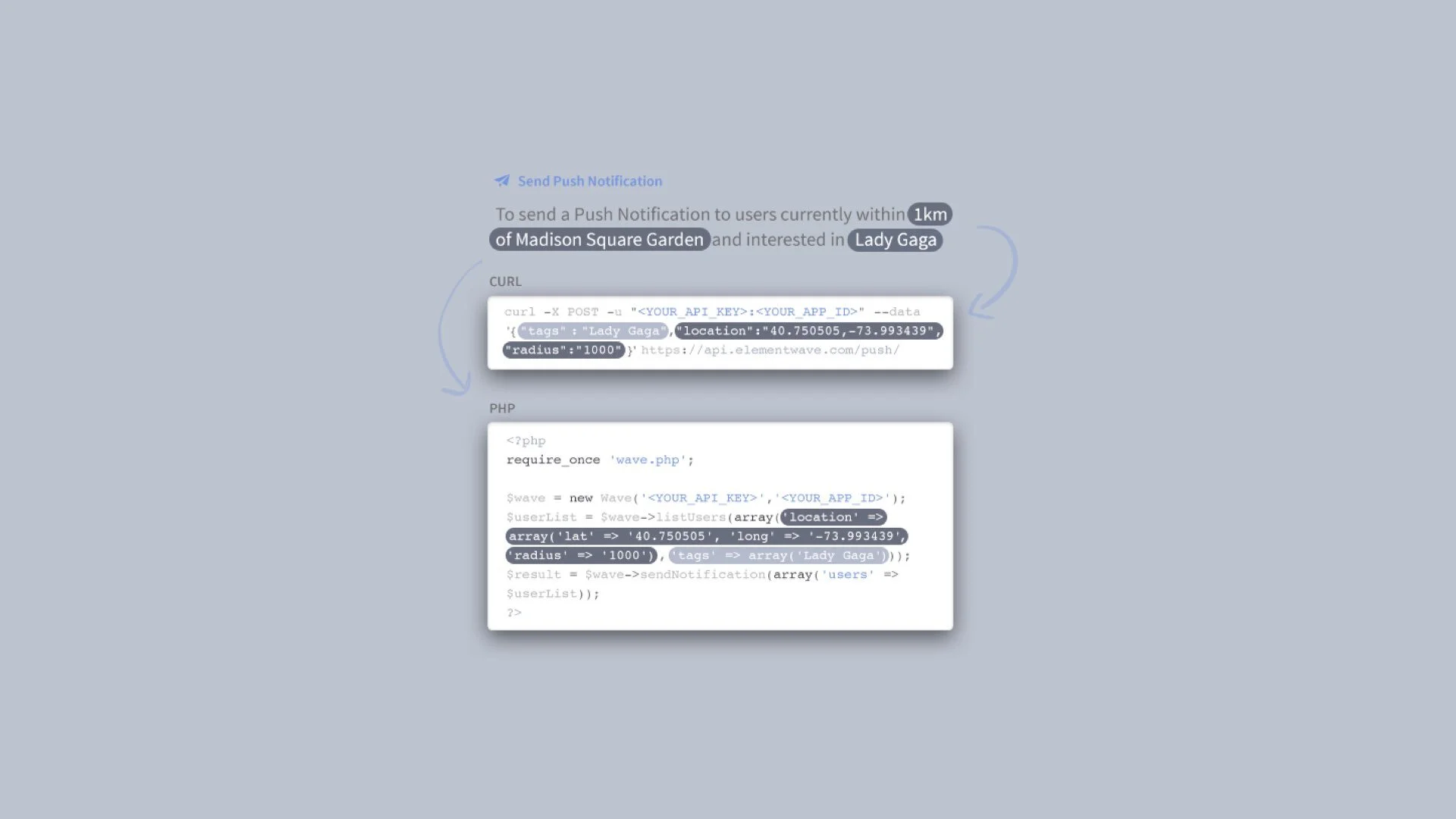
Even for an application that was as user friendly and accessible as Element Wave, screenshots of the product had to be carefully curated and positioned. We developed several small spot illustrations to help bring some well deserved life to them. Blending illustrations with the product’s clean and crisp interface was a challenging but engaging problem to solve. The illustrations created a lot of opportunity to bring life to product screenshots. Code snippets also showed how easy it was to integrate the solution into the customers mobile applications. Finally, we used the Careers pages to showcase Element Wave’s startup culture, employee benefits and opportunities. This aimed to help recruit new people by effectively communicating the company mission.
© 2025 Element Wave


